Creativity comes from the spark of an idea: but what causes the spark? It can be a word or an image, an idea or event: and sometimes different sparks can lead to the same result. Today, I will present you with 8 Creative Metro Map themed Design. For me, I like this kind idea overall. Just curious, where the ideas come from, or who had the idea first.
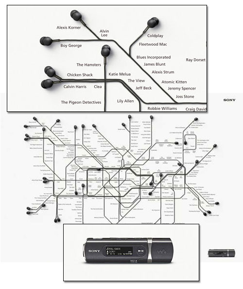
1. Sony Walkman: London Underground
Same idea are used for New York Subway and Sydney Metro in this campaign.
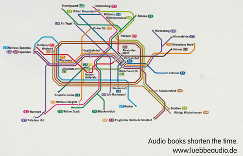
2. Luebbe Audio Books: Berlin
Tagline: Audio books shorten the time.
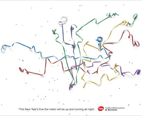
3. Company: DDB ESPANA, SPAIN, Madrid
This one is real metro advertisement… but with different way to represent the normal subway line.
Tag line: This new year’s Eve the metro will be up and running all night.
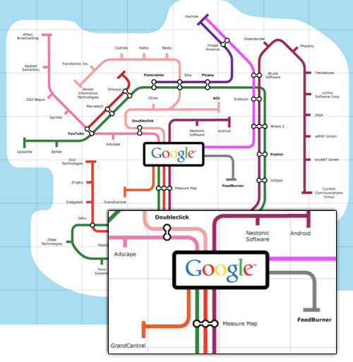
4. Google Acquisitions Subway Map
The Google acquisition and investment map below was created by the folks at MeetTheBoss[link] (http://www.meettheboss.com/google-acquisitions-and-investments.html#) (they’ve made similar visualizations for Amazon and eBay). There are a few deals missing like last week’s reCaptcha acquisition (see CrunchBase for a more complete list), but the subway-map visualization above gives the broad outlines of Google’s acquisition path.
The longest lines with the most stops (each stop represents a deal) are technology (dark violet) and web services (green). Startups which fall somewhere on those two lines seem to have a stronger chance of getting picked up by Google, at least historically. Other shorter, but overlapping lines, include advertising (pink), search (salmon), mapping (violet), social (red), video (dark red).
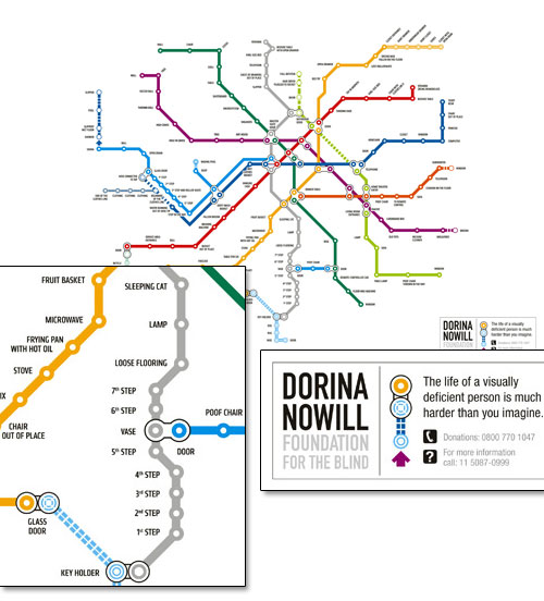
5. Dorina Nowill Foundation For The Blind: Metro ma
Tag line: The life of a visually deficient person is much harder than you imagine.
6.The Gastrointestinal System Represented As A Subway Map
You’re trying to get to the liver? See, what you wanna do is take the red line past the stomach, then switch trains at the small intestine. Green line’ll take you right there. Oh, you need to get to the appendix after that? Get back on the green line, back to the small intestine, switch to the red southbound, then get off at the large intestine station. The purple express goes right to the appendix. Whatever you do, stay off the blue line. It winds up in a pretty bad neighborhood. [link]

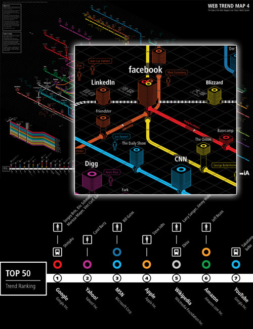
7. Mapping the internet with Tokyo Metro
Information Architects (iA) recently published Web Trend Map 4, the latest version of their popular web diagram. The diagram references a selection of the top 333 websites based on traffic, revenue, age, ownership, and character.
The subway map metaphor beautifully illustrates the interconnectivity and relationships between websites (represented by stations). The height of the station represents the site’s popularity while the width illustrates its stability as a business entity. The position on the map indicates if it belongs to the major traffic hubs or the online “suburbs”.
Not sure why Tokyo Metro Map… but accroding to author’s word “Because it works.”
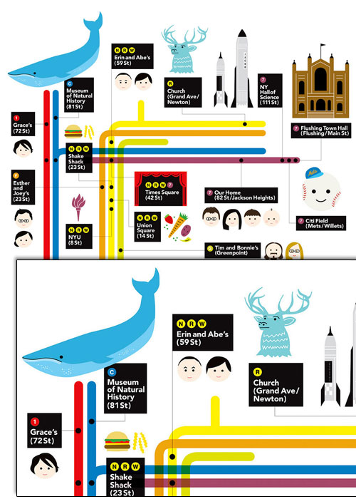
8. A three-year-old’s view of the NYC subway (Kottke)
Jason Kottke’s birthday present to his nephew is a subway-style kid’s mental map of New York city. Thanks Melissa. From Kottke.org. “This was my present to my nephew for his 3rd birthday. He loves, loves, loves the subway so my sister asked me if I could make a custom map with all the places that mean something to him on the poster.”
Number 3 is Barcelona, not Madrid
The third corresponds to the metro map of Barcelona (Catalonia).