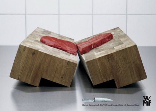
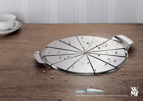
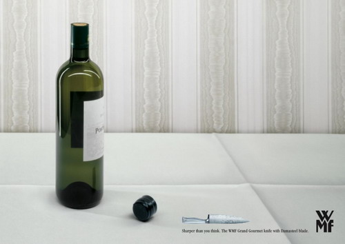
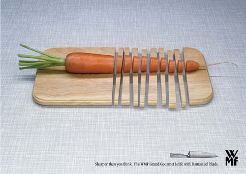
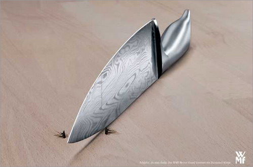
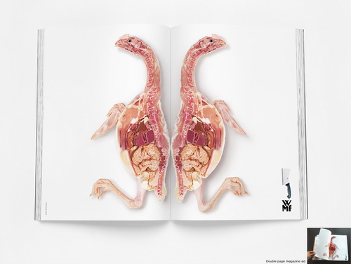
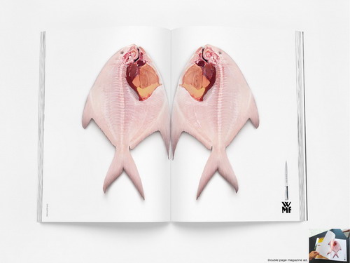
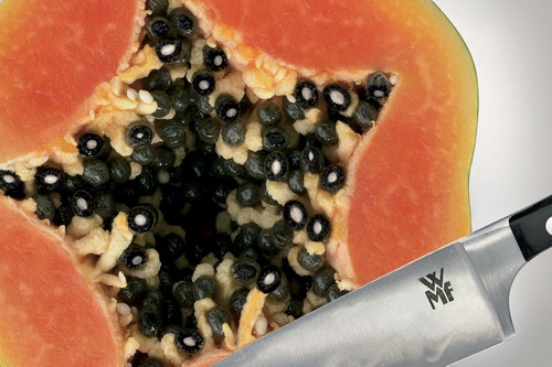
WMF knife ads series is one of smart ads I ever saw. Its agency used a kind of humor exaggeration to display audience how sharp their knives can be.

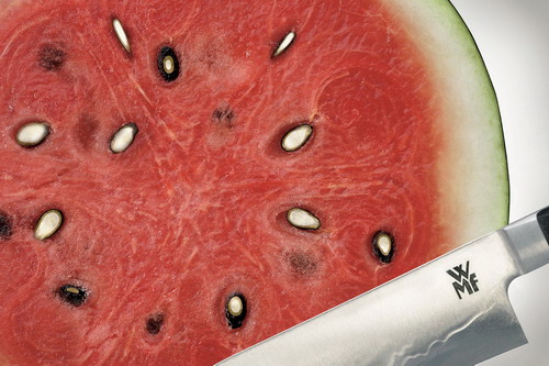
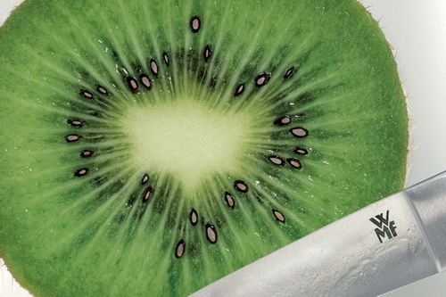
If you look carefully, you will find the seeds in following three fruits are cut into half.
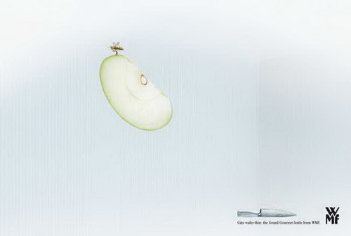
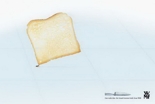
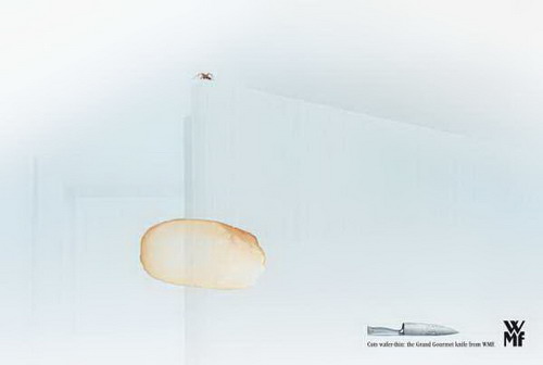
The following three try to display how thin slice the knife can cut: They are so thin that even bee/ant/spider can lift the slice.
Honestly, I am not really get what following ads try to convey. Try to say the knife can do elegantly fruit carving? Any way, they are still visually beautiful. Hence I still put them there. Maybe you guys can tell me what the ads try to tell its audience.

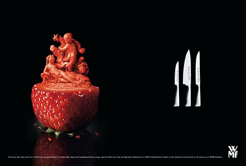
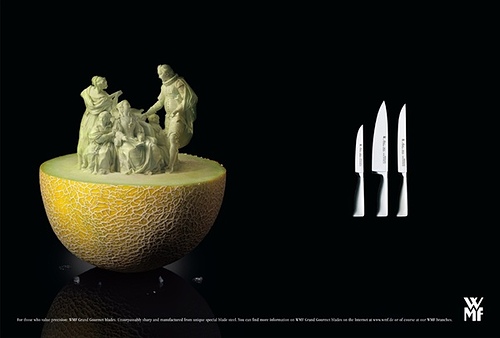
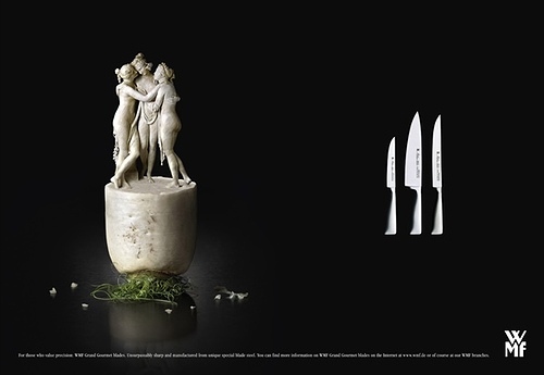
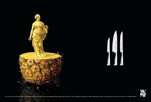
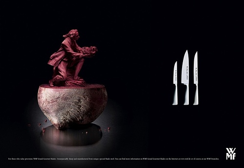
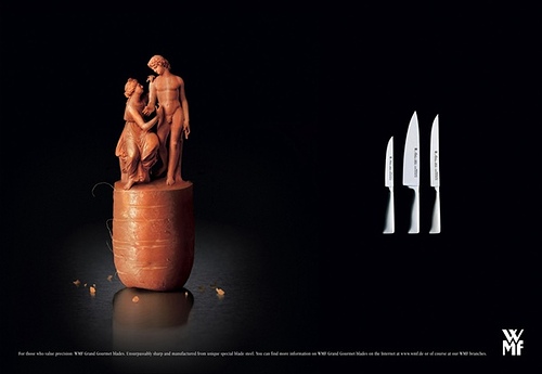
I think the last series of ads were probably just trying to convey the sharpness – carvings like that in something like fruit would require a ridiculously sharp knife!
For the record, your “White turnip” is a parsnip,, and you “purple carrot” is a beet! *grin*
These are some really great pictures though.
I think the series of pictures that you weren’t sure are supposed to convey something like this: The knives can cut fruits, bread, etc, so THIN that bugs can carry them. That would explain the any and the flying insect and the spider. Just a thought.