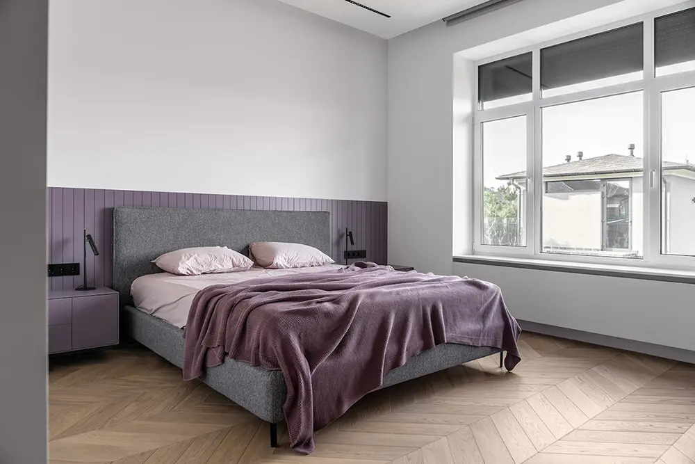
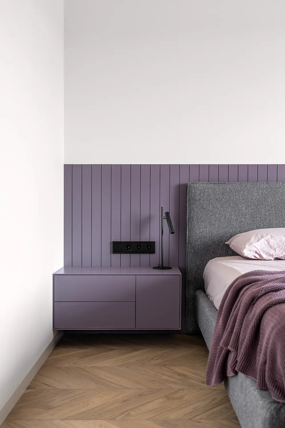
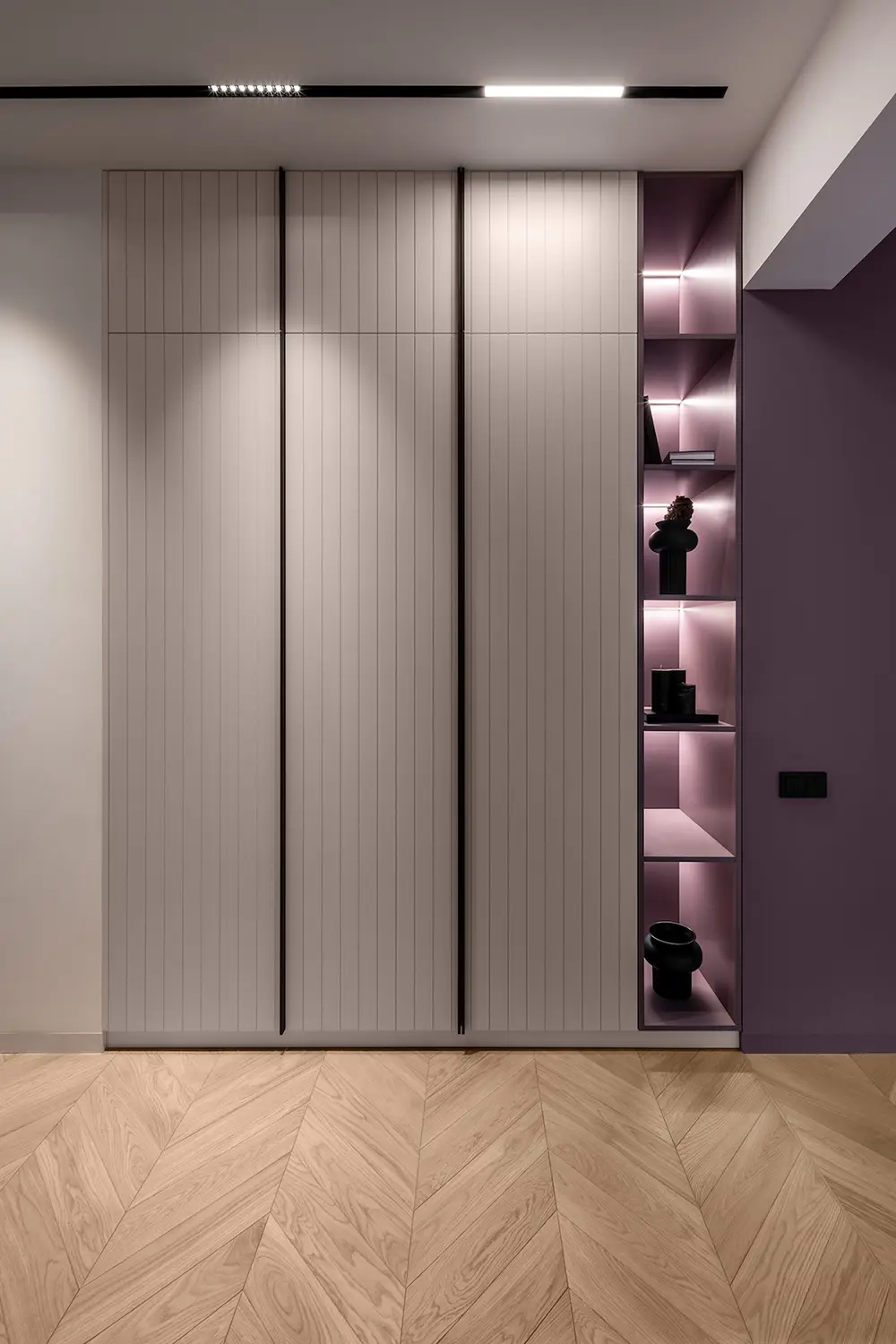
House Violet, designed by Natalia Chernyatevich and Anastasiia Kyrpeta, is a beautiful example of modern Scandinavian design with a twist. This minimalist home blends the clean lines and neutral tones typical of Scandi style with playful pops of color, creating a welcoming yet sophisticated space. Throughout the home, careful attention to decor, lighting, and smart spatial solutions ensure both functionality and aesthetics.
Open Living and Dining Space
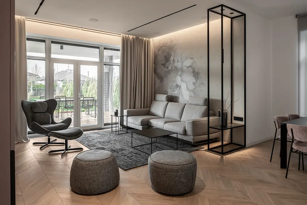
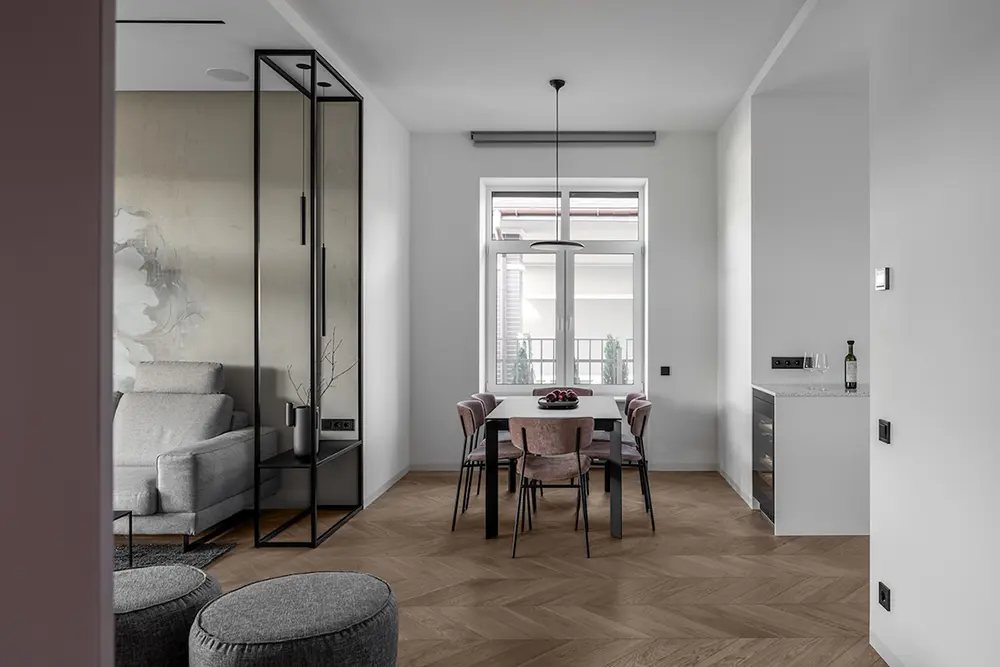
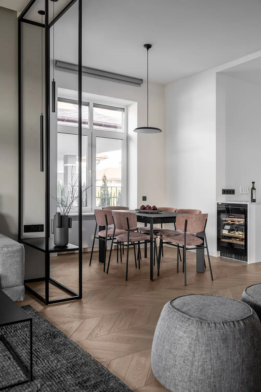
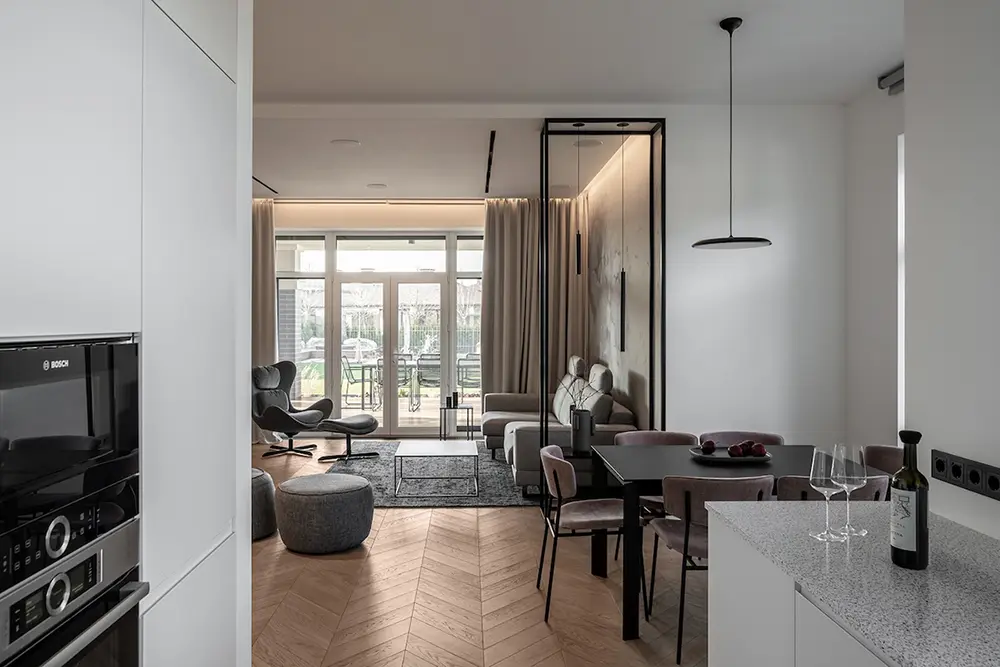
In the living and dining area, the Scandinavian influence is clear. The space features an open floor plan, with large matte black frames serving as decorative partitions. White walls dominate the dining area, while the living room stands out with subtle beige floral wallpaper. The seating in the living room is smartly arranged, with comfortable couches paired with a matte black coffee table for a modern, cohesive look. In the dining space, a matching black table is complemented by dusty pink chairs, adding just the right amount of color. Large windows provide lovely outdoor views, further enhancing the airy, open feel of the space.
Touches of Color in the Bedrooms
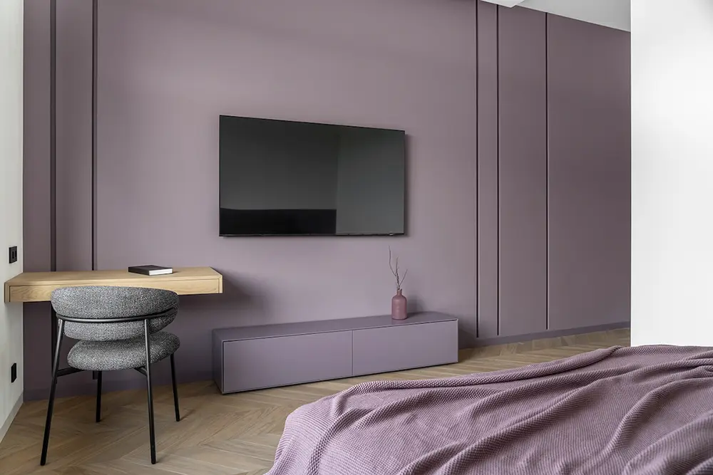
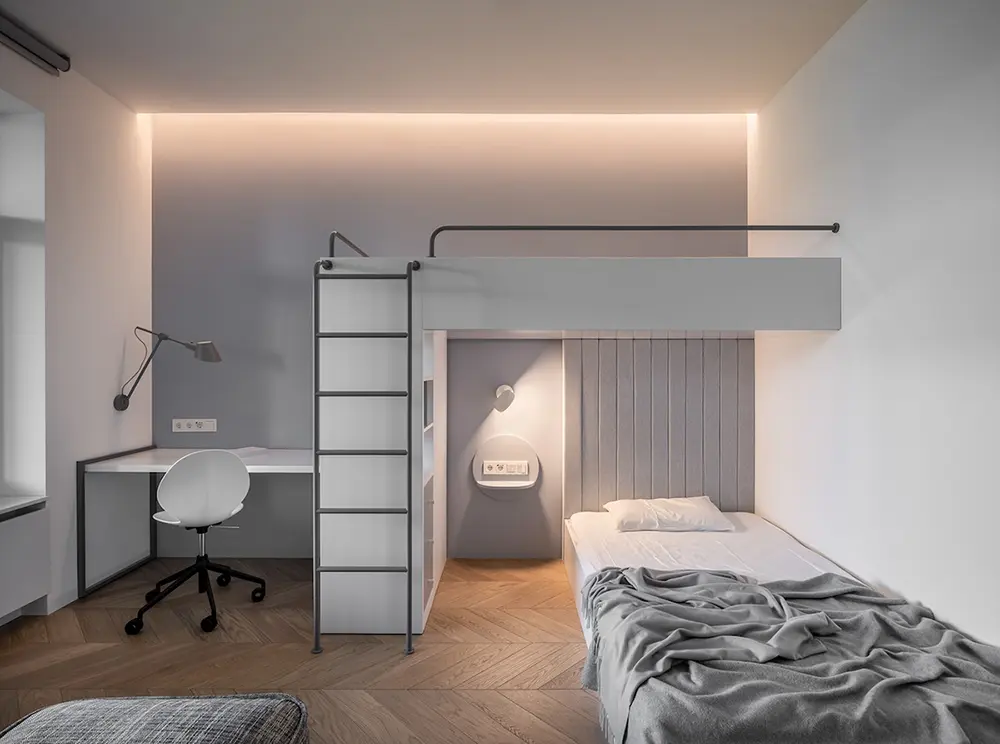
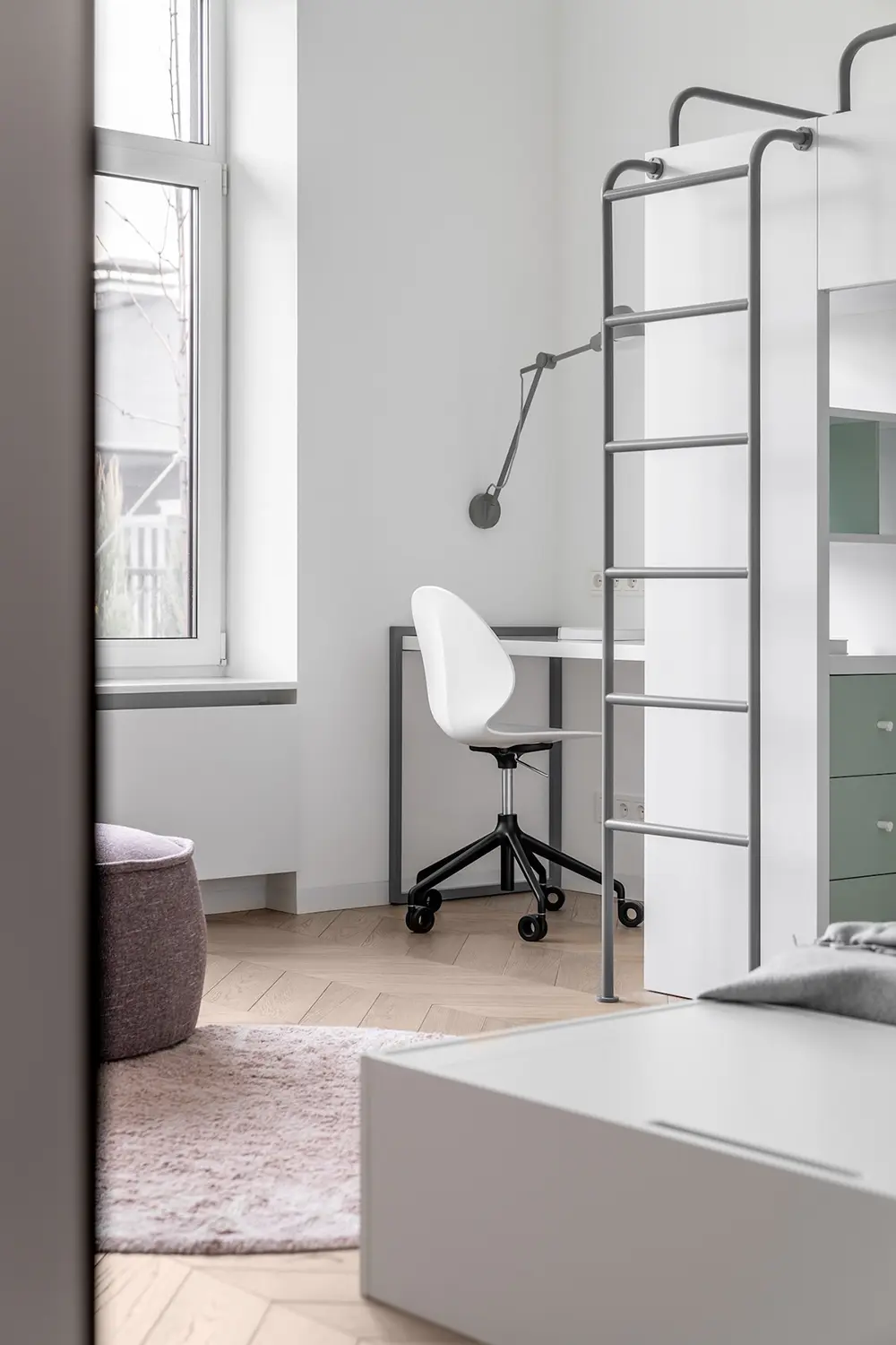
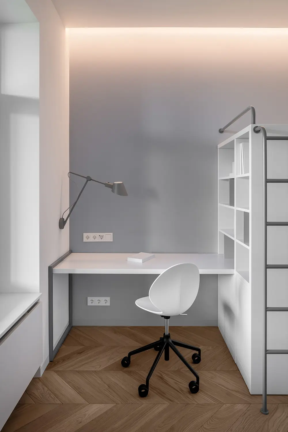
The bedrooms in House Violet stay true to the Scandinavian aesthetic with their white and gray palettes and wooden flooring. The second bedroom, in particular, incorporates fun, subtle colors—mint green cabinetry and baby pink entertainment units bring a playful touch to the otherwise minimalist space. The room also features a built-in ladder, which leads to a small nook perfect for working or reading. Cozy textiles complete the look, making it a warm and inviting space.
Bathrooms with Character
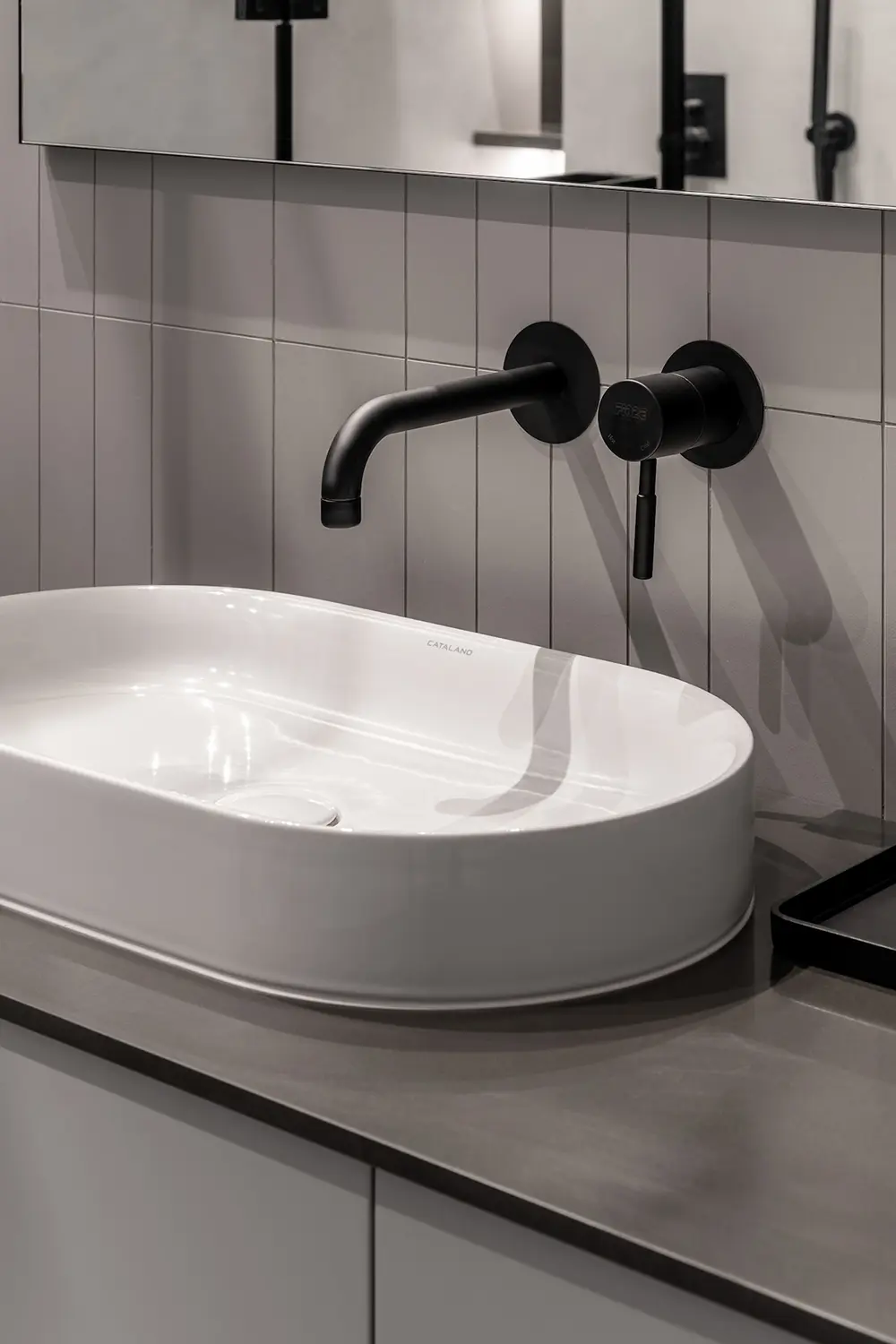
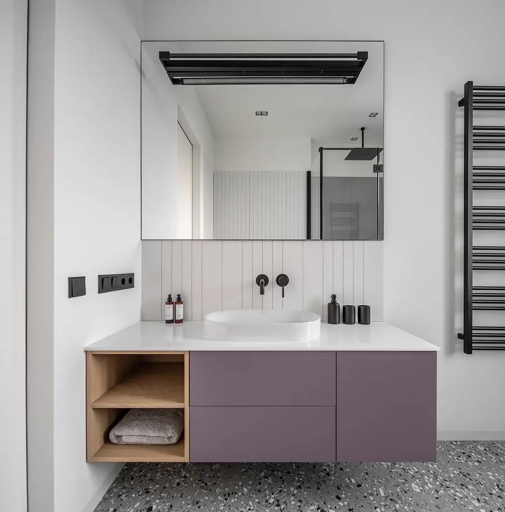
The bathrooms in House Violet are small but stylish. The first bathroom pairs modern and traditional design elements, with a lilac vanity adding a touch of color against the neutral backdrop. Matte black fixtures and a vessel sink enhance the sleek, modern vibe, while wooden storage compartments add warmth.
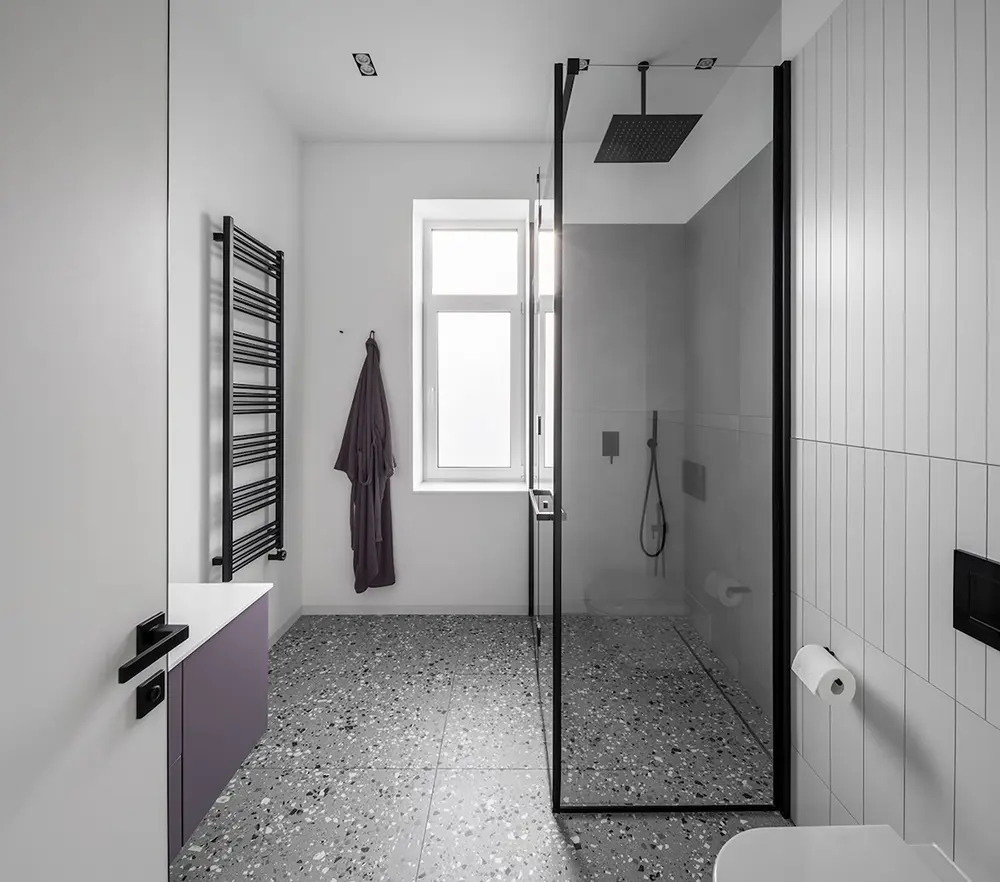
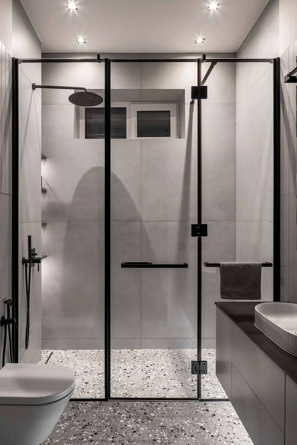
In the second, more compact bathroom, the color palette sticks to gray and black. A glass partition with black frames separates the shower cubicle, creating visual interest and maximizing space. A wall-mounted black vanity helps to free up the floor, making the small bathroom feel more spacious. The stone chip flooring adds texture, keeping the design simple yet intriguing.
