These days, I saw an interesting ads campaign from Philips about flat television. It is pretty straightforward and easily-understanding.

However, if you think it again, you will find the idea is kind of stupid. OK, the television is so thin that you will lost it in the gap between subway and platform. But, will you carry a television without wrapping on the road? With the those wrapping, can the television still be slim enough? Below are two more ads design from this campaign.
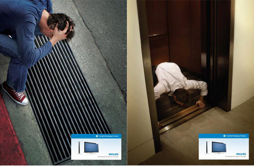
No matter how unreal the story presented in the ads, it still successfully convey its “thin” feature. Just wonder how the rest manufacture will do to present the same “thin” feature. After some research, I got some more ideas.

I guess the concept is trying to express how slim the television is by showing “normally when we see a war we see huge rows of soldiers running towards each other .. here they don’t have that much space; so they arer in a line.”


Another set of ads try to convey its flat concept by using those flat-looking image… Honestly, I just don’t like those kind of concept… It is not that easy to get it.
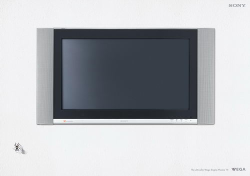
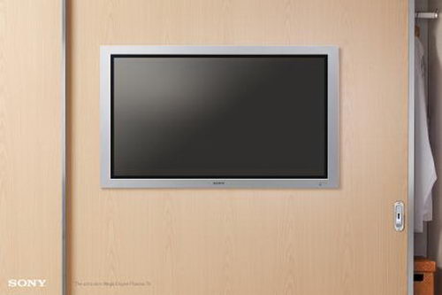
The rest three are from SONY, personally, I like them mostly. Easy to get, real life scenario…
