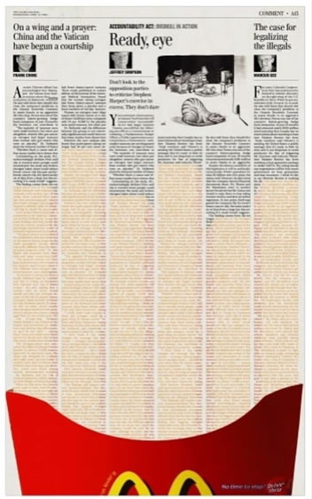
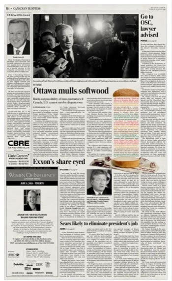
Due to the cost, paper quality and print limitation, I barely see eye-catching advertisement design on newspaper and never thought I would see anything good. However, these two McDonalds ads I came cross today, changed my mind totally. Not sure is how long these ads have been promoted, the design are pretty smart from my view. Just convince me again, sometimes, a clever idea can make up lots of things and brighten you eyes.


I read a piece by some very classic print designers – newspaper typographers if I am not mistaken – and they ere furious about practices like this. Not that they are against advertising or clever/beautiful advertising. It is just so that you do not know where the advertising starts and where it ends. And that has to be clear cut. And on another note: how legible is the text in the fries or in the burger? That would be another point.