As designers, we need to listen to our clients and make changes this and that based on their criticism/comments. Even we say, client is always right. But really? How many times we even didn’t want to admit we actually make these designs. Frustrated by stupid client criticism, Ireland’s creative community got together to release a lot of pent up anger and sadness through the medium of the A3 poster.
Ad creatives, designers, animators, directors, illustrators and more took time out to dress up their favorite worst feedback from clients and created this ”Sharp Suits” series. Take a look at our favorite ones from this ironic collection and more on there site.
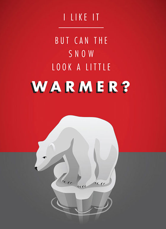
1. I like it. But can the snow look a litter warmer
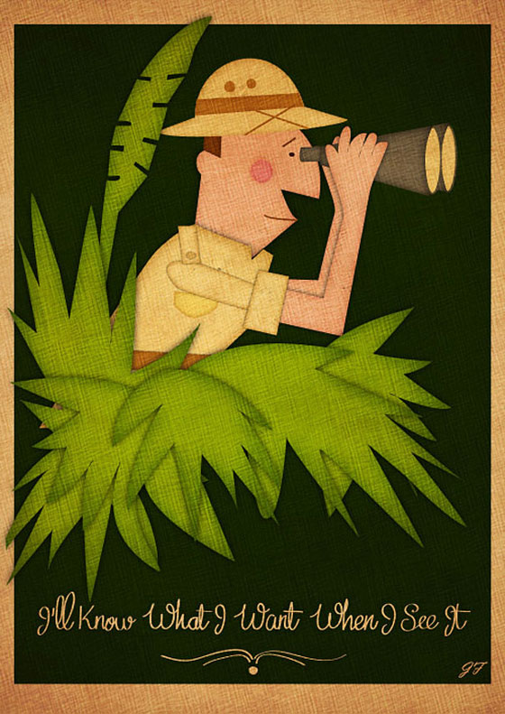
2. I will know what I want when I see it
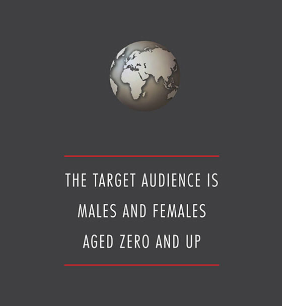
3. The target audience is males and females aged zero and up
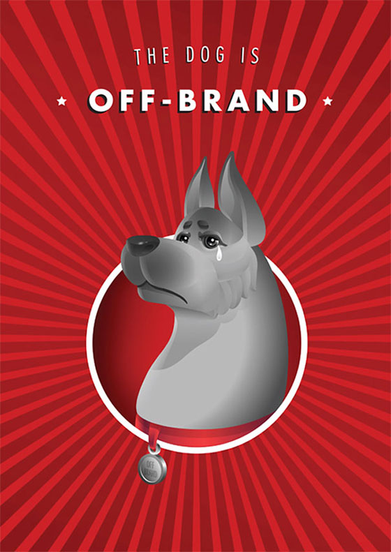
4. The dog is “off-brand”
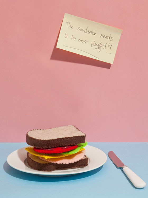
5. The sandwich needs to be more playful
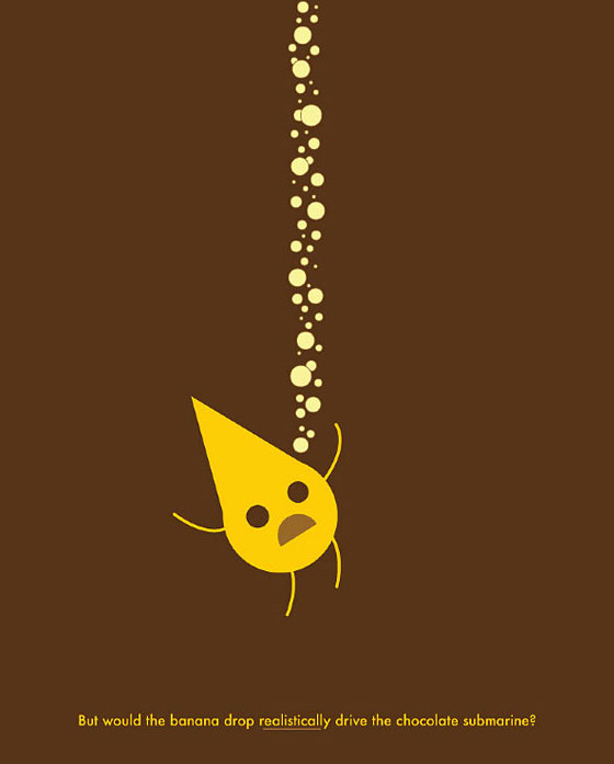
6. But would be banana drop realistically drvie the chocolate submarine?
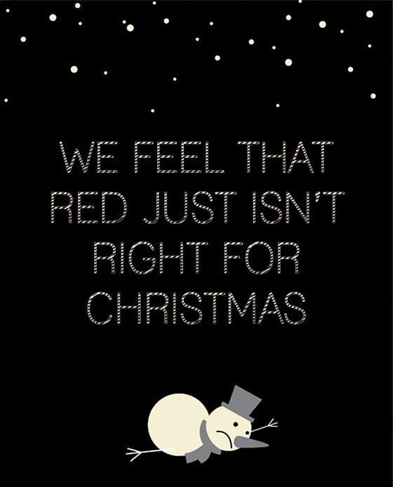
7. We feel that red just isn’t right for Christmas
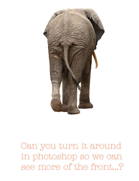
8. Can you turn it around in photoshop so we can see more of the front…?
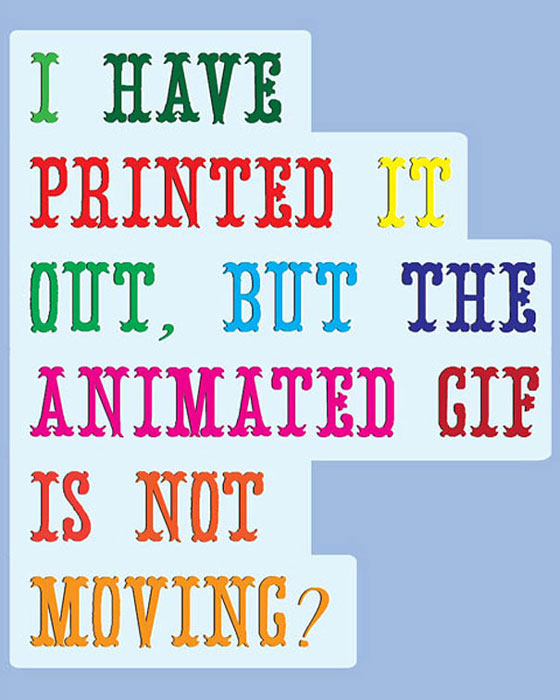
9. I have printed it out, but the animated gif is not moving?
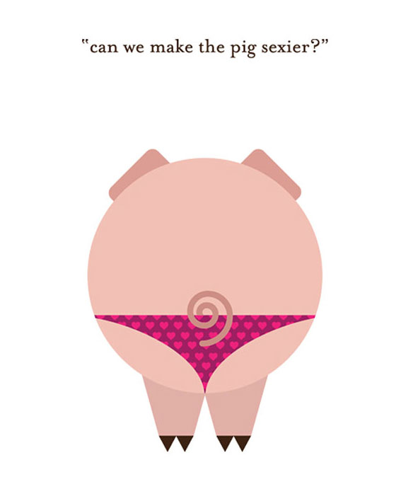
10. Can we make the pig sexier?
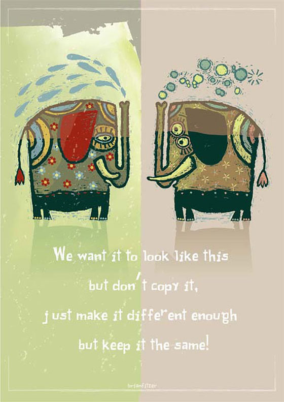
11. We want it to look like this but don’t copy it. Just make it different enough but keep it the same!
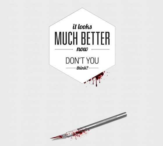
12. It looks much better now don’t you think?
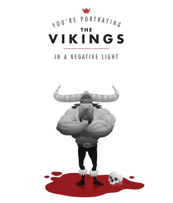
13. You’re portraying the vikings in a negative light
