Mobile Web browsing – the future
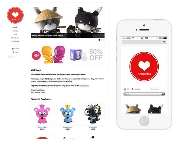
There will be 1.7 billion mobile web users by the end of 2013, according to market research firm Juniper Research. In such a scenario, every website wants to be mobile compatible. The easiest way to go mobile is to adapt your website in a pre designed mobile website template. So what to keep in mind while designing mobile templates? Here is what:

Tips to keep in mind:
1. Familiarize yourself with relevant hardware and software
Mobile phones vary in terms of the operating systems, screen resolution, screen size, user interface etc. Before building a mobile website template, you need to decide which platform you want to optimize websites for. This decision depends on the type of users. If a particular template is for business purposes, you could optimize for Blackberry. Browsers are another criterion to be considered. Finally keep in mind target phone users’ common screen size and resolution. Common resolutions for standard cell phones include 101×80 pixels (many Sony Ericsson phones), 128×128 pixels (some Samsung phones), and 120×160 pixels (many Motorola phones). There are more options where smart phones are concerned. The iPhone has a 320×480 pixel screen; the HTC Touch Pro has a 480×640 pixel screen; the Palm Pre has a 320×480 pixel screen; the BlackBerry Storm has a 360×480 pixel screen; and the HTC Venus has a 800×480 pixel screen.
2. Fluid layouts
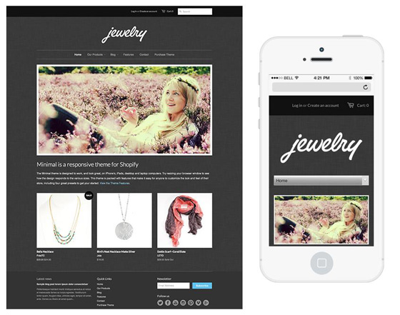
You might build your mobile site for a specific kind of browser, but what if it is opened in another browser? It is not possible to track down the appearance of your template for each and every browser that is available. However what can be done is to make sure that your layout will automatically adjust to the screen size. One way to do this is to keep in mind to set width in percentages or ems instead of the conventional way of setting width, that is, in pixels. So instead of setting width as 960px, consider setting it as 100 per cent.
3. Interaction
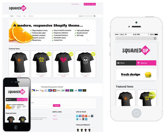
On a website, interaction is one of the key ways of keeping a website alive. There are various links, pictures that lead to more information and other sort of interaction with the user. However, if this happens on a mobile, it is likely the user will be frustrated. This is because a finger is considerably less accurate than a mouse pointer. Therefore consider making interactivity less while designing your mobile website, unless it is a template for an online game.
4. Image use
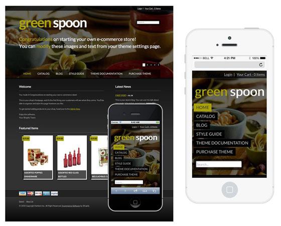
Make sure the layout of your mobile template does not use too many images. Images on a mobile phone serve significantly less purpose than on a much bigger screen like a PC. It only makes the user scroll further to reach relevant information. Logos etc. are fine but keep unnecessary image layouts at bay.
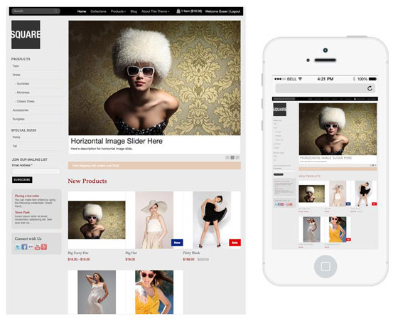
5. Optimizing navigation
Make sure your template includes a provision for easy navigation. For instance, it would be a wise decision to have a website on a phone scroll only one way, that is, either horizontally or vertically. This is because it is easy to scroll wrong on a phone if scrolling is enabled in all directions.
