A beer’s label is the bottle’s shopfront because it displays its logo design in a way that appeals to its customer base. Up until recently, wine bottles received much more love than their beer counterparts, but the popularity of craft brewing has made way for a creative label revolution.
From international beer to local offerings, big names to indie brew houses, there are a lot of impressive beer label designs you can use for inspiration, including the ones in this article.
Incredible Beer Label Designs That Break the Mold
Sometimes it’s difficult to come up with a great beer label design you’ll want to keep with you for years, so if you need help choosing a logo for a brewery, take a look at the following examples.
1. Goldhawk Ale
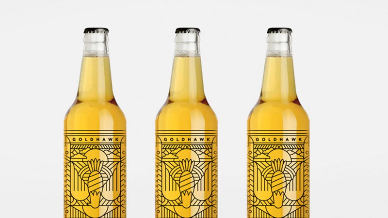
The Goldhawk logo clearly prefers minimalism over a complicated, overground logo, and it really works for their brand. With no distracting text on the front label, beer lovers are taken in by the intricate design on its transparent sticker, which shows the distinct color of this pale ale.
2. Around the World Beer Flight
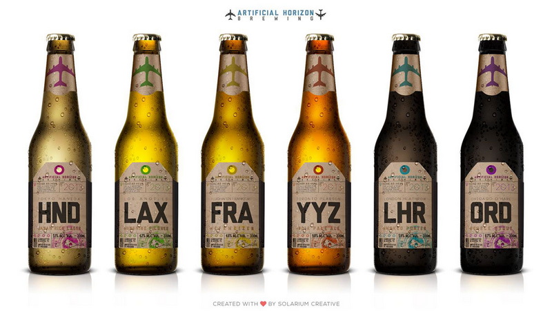
Designed by Solarium Creative, these eye-catching beer labels take you on a journey across the world. Inspired by vintage luggage labels, every beer is meant to represent a major airport. Look out for Artificials Horizon’s next creative venture, inspired by centuries-old suitcases.
3. Sputnik
Sputnik from Austin Beerworks is a tasty coffee oatmeal stout that goes down smooth, but it’s design looks nothing like a beer. It more so resembles soda, with a design that plays around with bold colors and shapes. You’re sure to pick this beer out from any store shelf.

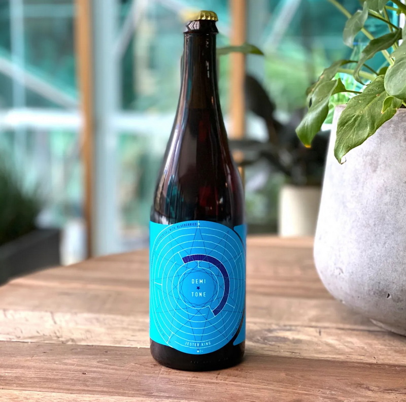
4. Demi and Tone
Demi and Tone’s label was designed by artist and beer maven Josh Cockrell, and it definitely shows. Only a creative person could come up with such a colorful label that borders on modern art. Unsurprisingly, the bright, berry blue colors represent the blueberry flavor inside the bottle.
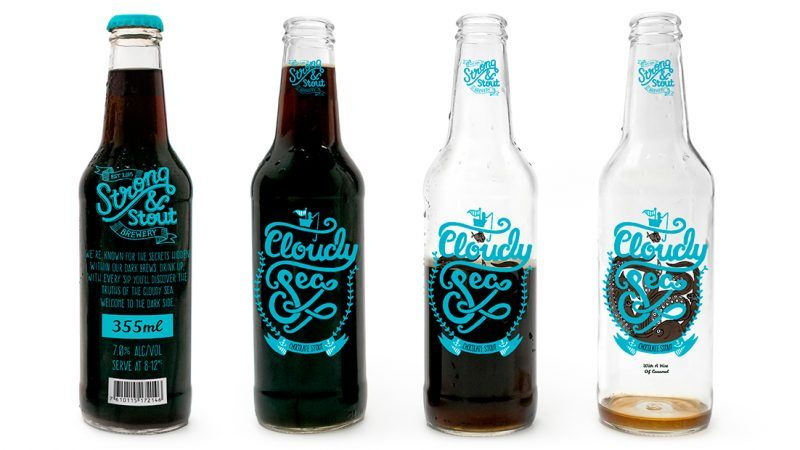
5. Cloudy Sea
Made by Strong & Stout Brewery, Cloudy Sea is a strong contender for one of the most interesting beer labels around. At first glance, the label only features a small fisherman up top sky blue cursive, but as you drink, you’ll see a fish and an octopus wrapped around the letters.
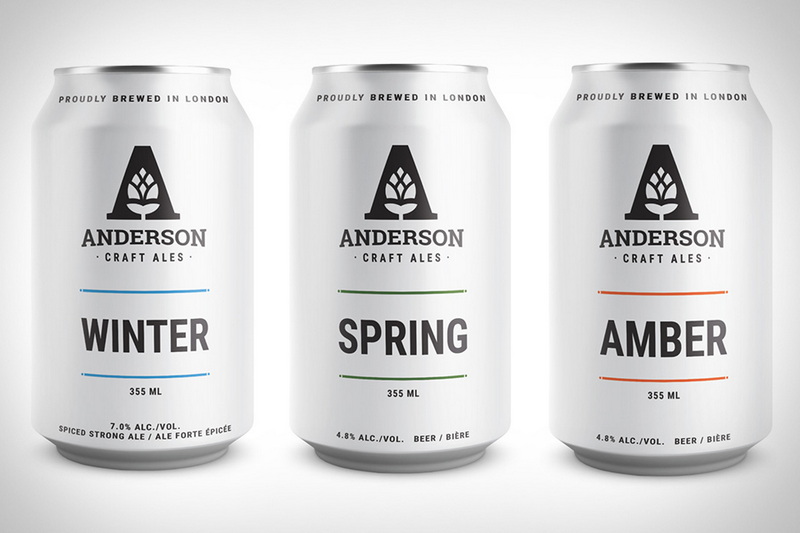
6. Seasons Collection
No one said you had to make an eclectic design to turn heads. Sometimes simple is the best look for your brand, and Anderson Craft Ales Seasons Collection takes that advice to the extreme. Besides a slight color change, the beers look identical but taste entirely different.
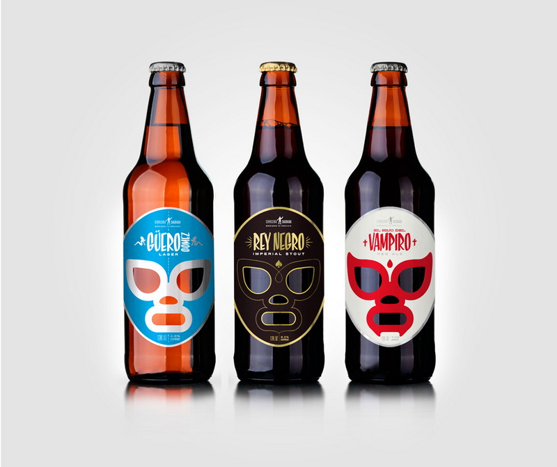
7. Cervecería Sagrada
Brand consistency is just as important as making an attractive label, and Cervecería Sagrada embodies this. Inspired by Lucha Libre, all of Cervecería Sagrada’s beer bottles feature colorful wrestling masks that separate each flavor by color, like blue, black, white, and red.
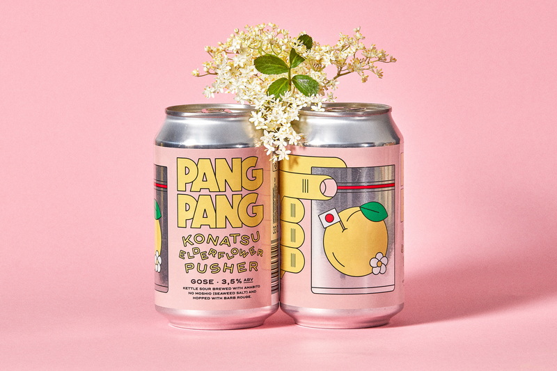
8. Konatsu Elderflower Pusher
The Stockholm microbrewery, PangPang, has been developing and perfecting its incredibly designed beer labels since 2014. Of all of their creative designs, the Konatsu Elderflower Pusher is one of the best, mostly because of its overall 60’s vibe and pink background.
9. Evil Twin NYC
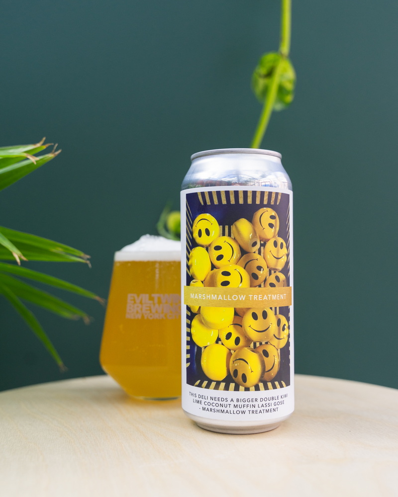
Featuring unusually long beer names like “This Deli Needs a Bigger Double Kiwi Lime Coconut Muffin Lassi Gose,” Evil Twin NYC’s bottle design looks and feels similar to Jones Soda. That’s because it uses real photographs on each of its cans, most of which resemble rave culture.
10. 50/50 Brewing Series
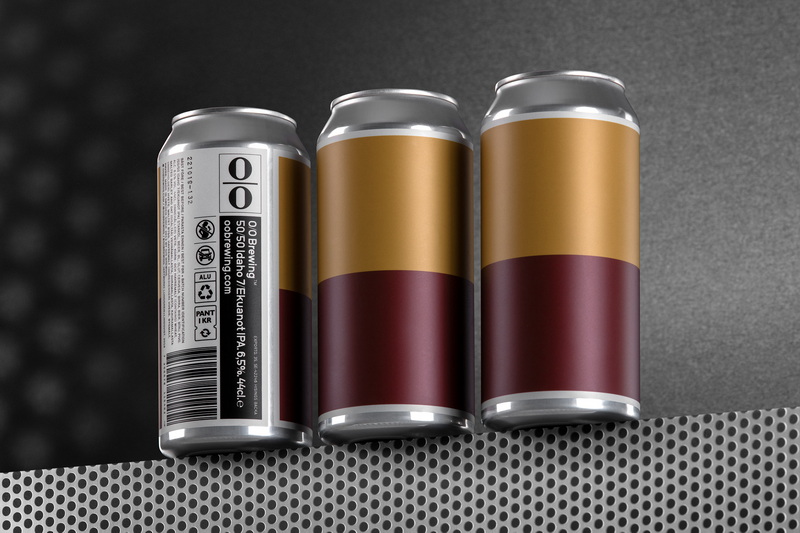
Swedish design is often composed of blocky colors and minimal features, and 0/0 Brewing no doubt takes inspiration from their homeland. 0/0 Brewing’s 50/50 series pairs two hops and assigns each its own color, so you’ll instantly know what’s in the product from sight.
