In today’s fast paced, highly competitive world, a business needs to take every opportunity it can get to create a memorable, effective brand. One of the chief trends in doing so is that of the adaptive logo.
What exactly is an adaptive logo, why is it effective, and how can you make it work for you?
Check out this article with our ten tips for making your logo adaptive.
What Is An Adaptive Logo?
An adaptive logo is, more or less, what it sounds like. “Adaptive” is about adaptability. So how would you define an adaptive logo?
- An adaptive logo is designed responsively. It alters depending on the platform being used. If you look at a website on your computer and compare it to the same site on your cell phone, the format should change for ease of use.
- An adaptive logo has multiple versions. Think, as an example, of the logo for a company as found on a letterhead, versus the logo for the same company as used to represent their smart phone app.
- An adaptive logo is consistent. Regardless of the variation, it will still be recognizable as belonging to the company it represents.
Adaptive logos also refer to logos which cycle, or rotate. The basic elements will stay the same, rendering it easy to recognize, but some parts may change, such as the color or the background.
These logos may change to reflect certain services or departments of the company, or features or exhibits, such as in museum logos.
Now that we’ve got that defined, let’s take a look at how to do it.
Tip One: Find Your Focal Point
Creating an adaptive logo can be pursued in different ways, which we’ll look at throughout this list of tips. But it’s important not to lose sight of continuity.
“Continuity” may not seem like it fits in well with a logo that changes depending on the circumstances, but that’s where finding a focal point comes in.

Source: Whitney Art Museum
A quick real life example of this is the Whitney Art Museum, which uses a zig-zag as its logo. The simple thin-point line art references the initial W, but can also be adapted sizewise, turned upside down or on its side, or altered in color and other details. Whatever the case, it still serves as a focal point for the brand’s logo, regardless of what it is adapting to at the current time.
Finding your focal point can foster continuity. But it isn’t the only important aspect of an adaptive logo.
Tip Two: Experiment With Spacing
Spacing is a huge part of creating an effective, memorable logo to begin with. To make it adaptable to the platform, it’s more than just a matter of squeezing it down in size. Doing this may render it completely illegible, and an illegible logo is an ineffective one.
Official logos generally have a basic overall shape to them, but when it comes to adaptive logos, that shape constraint may have to go.

Source: LogoDesign.Net
Even the internal shapes may have to be adapted somewhat. When it comes to moving elements around for adaptive logos, there are no rules other than, “Make sure it’s still an effective and identifiable logo.”
Tip Three: Select Partial Graphics
For original logos with more extensive graphics (think the Marvel Comics logo used in the films, for instance) formulating an adaptive logo may be more a case of picking and choosing.
That is, pick and choose a portion of the original logo to represent the company, if the entire logo will not fit responsively
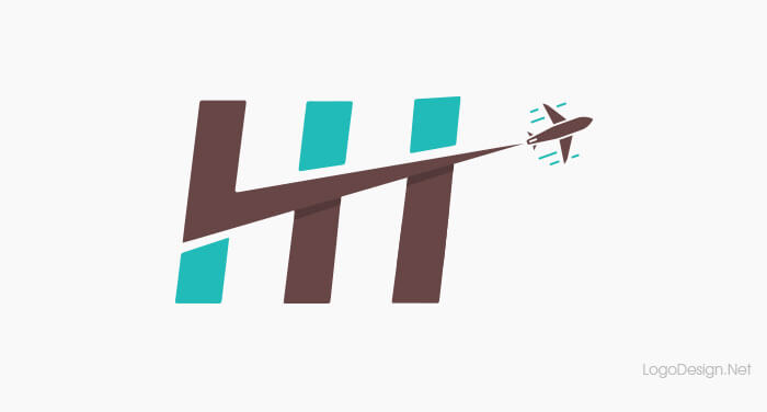
It’s best to choose a portion that is most recognizable, such as the beginning letter of a wordmark, or the central focus of a graphic-based logo.
Tip Four: Use Font Variations
It’s not uncommon to come across fonts that look great and are very legible when they’re in large or even medium sized point, and less than user friendly the smaller they get.
In the interests of consistent brand design, it’s best to have multiple fonts in your style manual.
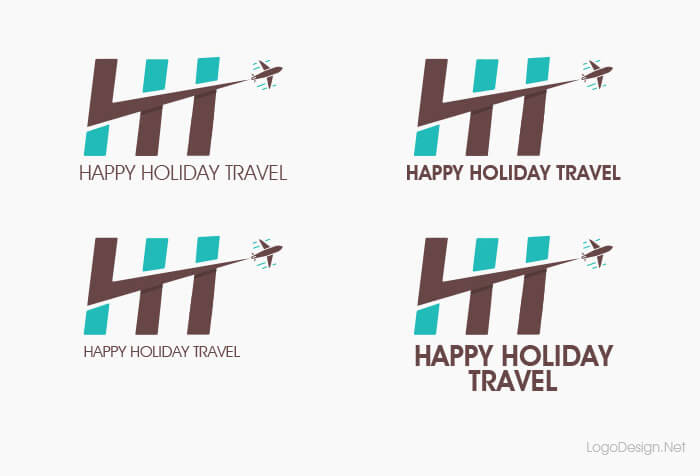
This helps out greatly with adaptive logos, meaning that you can switch to other, more legible fonts if your logo needs to shrink in size or alter in shape.
Tip Five: Swap Out Colors
Your original logo should already have variations in place: the original color scheme, a one color scheme, and black and white. Part of creating an aesthetically appealing, effective logo is making sure that these three variations are all equally workable.
When it comes to adaptive logos, it’s likely that you’ll have lost some of the elements of the original design. Because of that, some of the colors in your original color scheme may have also gone by the wayside.
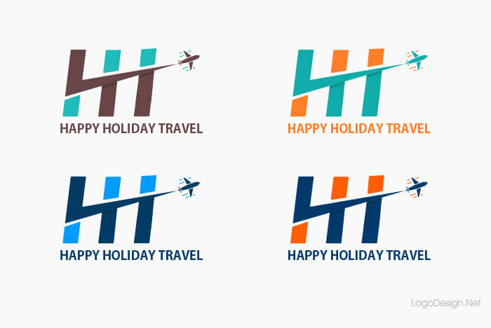
Changing out colors as your logo adapts to different platforms can help to keep all of your color style manual in play.
It can also help with differentiating different departments of your company.
One example would be for an online site with multiple vendors, such as Etsy or eBay. The virtual shopping app might be rendered in a different color than the vendor app, though otherwise the logo could be identical.
Tip Six: Use Area-Specific Graphics
Clip art has long since gone the way of the dinosaur. But that doesn’t mean that adopting a series of simple vector-based graphics for your adaptive logo isn’t useful.
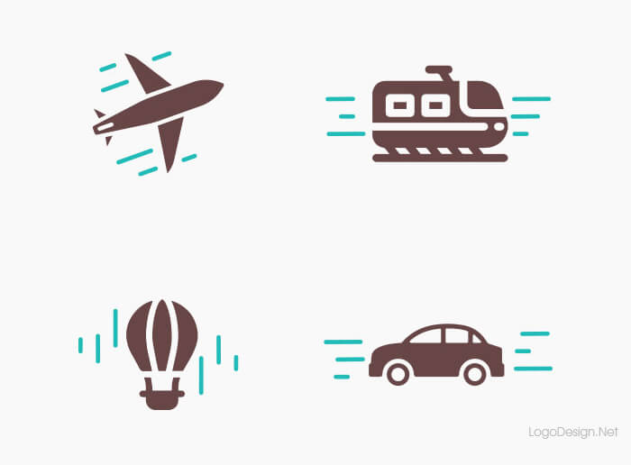
Along with your original logo, develop four or five alternative graphics that fit in the same tone and style. These can be used in different apps, different platforms, or even to help separate the pages or sections on your website.
Tip Seven: Use A Roster Of Rotating Versions
As mentioned above, adaptive logos can also include a roster of rotating logo variants.
This is often seen in logos for theater companies, which may alter their logo to reflect their current season playlist, or museums, which can change to highlight their current featured exhibit.

Source: Underconsideration
This can also be a fun way to reflect the aesthetic and tone of the company, such as with Slate Magazine, which alters its “tagline” beneath the main site page logo with alternating references to real news and hyperbolization.
Tip Eight: Adapt Your Logo To Use In Unexpected Places
One of the best features of stripping down your logo to a focus point is that it can then be incorporated elsewhere in your site — even in areas where a logo wouldn’t necessarily be found.

Source: Exploratorium
A good example of this is San Francisco’s Exploratorium, which uses a large open “O” as the focal point of its lettermark logo.
This simple focal point means that the logo can be reflected in content throughout the website, in marketing and social media, or at the physical Exploratorium building itself. This is a great way to reinforce the memorability of an adaptive logo.
Tip Nine: Create A “Stable” of Platform-Specific Logos
Let’s start this tip by thinking about your main logo. If your company has been around for a while and you’re simply looking to upgrade to fit modern usage, you likely already have a logo which is effective and memorable.
If not, and you’re a new start up looking to create a logo that translates across all platforms, it’s best to start by developing the full version of your logo design, either with the help of a designer or using an online logo maker tool.
This will help to ensure continuity across platforms, as you can always go back to the original and compare the second and third variations.
The full version of your logo would likely be used on your website, letterheads, and business cards, as well as any other official company products or marketing materials. It will include the logo design, the company name, and perhaps even the company slogan.
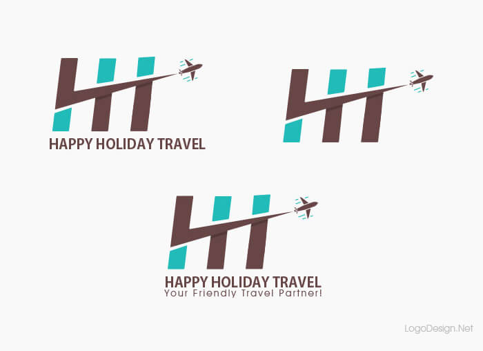
With the main version of your logo as a springboard, strip it down gradually to create a second and third version for use in different applications or platforms.
A second version may not have all the information of the original, such as the slogan. It will be simpler.
This variation of your logo may be used as an adaptive logo on a company app, meaning that it still represents your brand even if your customers are using their smart phones rather than a laptop or desktop computer to access your website.
For your third step in an adaptive logo, you’ll create an even more basic version. This may simply be a lettermark or wordmark, or a simple graphic.
This variant of your logo will, again, be useful for responsive design for cell phone or tablet users. It could even be used as the main icon for a company app.
These second and third versions of your original logo can be created either by removing elements or by using the tips found above.
Tip Ten: Continue To Adapt
As you gather your variations on your original logo, it’s always a good idea to do some test runs.
This helps to ensure that each logo is truly adaptive and responsive.
It also can tell you what works and what doesn’t on an aesthetic level, as well as what’s memorable and what isn’t.
As trends come and go and the needs of clients change, certain features of your adaptive logo may not be as effective as they once were. The aesthetics may change, your font may suddenly be out of favor in the design community, or someone may invent yet another way of viewing technology which requires further adaptation and responsiveness.
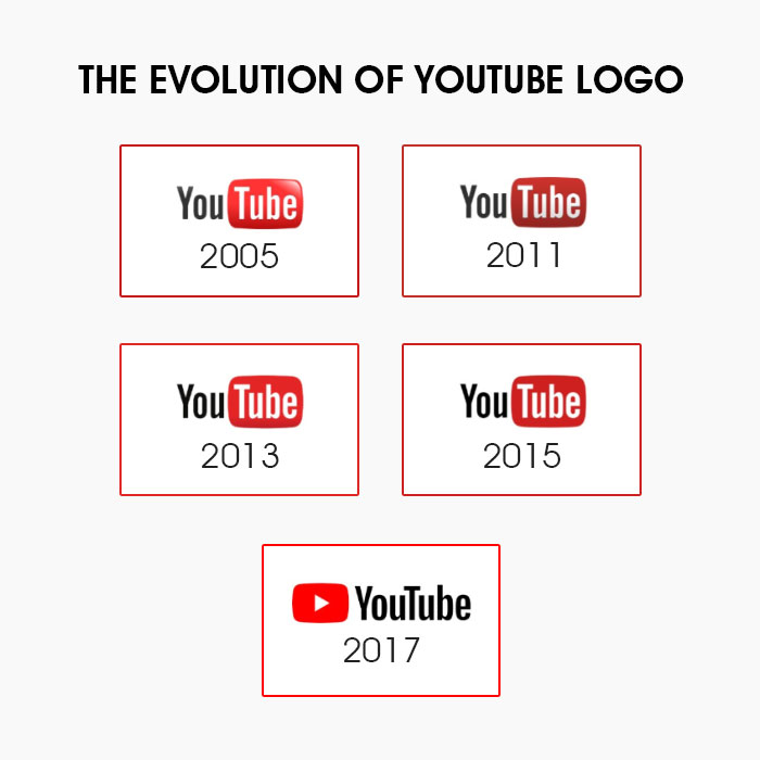
If you want to keep up on the cutting edge — and keep your edge against competition — it’s necessary to continue to adapt. Adaptive design is not a “one and done” proposition. Keep adding, keep testing, keep altering, keep growing, and keep adapting.
The Upshot
Adaptive and responsive design is live design. It changes with the needs and interests of the company, and draws new customers in while keeping the interest of established clientele.
Whichever direction you decide to take with your own adaptive logo, don’t be afraid to think outside the box. Logo design is important, but it isn’t a matter of “just one shot.” If something doesn’t work, change it.
That’s what adaptive logo design is all about.