What is your first impression of a shampoo ads? Beautiful women with long, shining and smoothly hair? 80% Shampoo Advertising ends up like this. However, there are still some unusual and creative work which Pantene is a good example. I am not saying it has better shampoo, but Pantene does put some extra effort to make its ads more attractive, impressive and eye-catching.
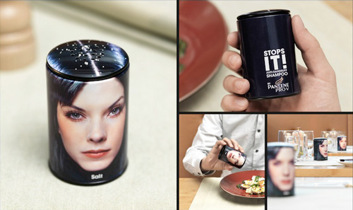
Pantene – Dandruff Salt Shaker
It may force you to lose your appetite, but this campaign by Pantene sure is effective. Salt shakers, in the design of a woman’s head, were placed in bars, restaurants, and canteens. When shaken, salt crystals trickle out in the shape of dandruff. Check, please!
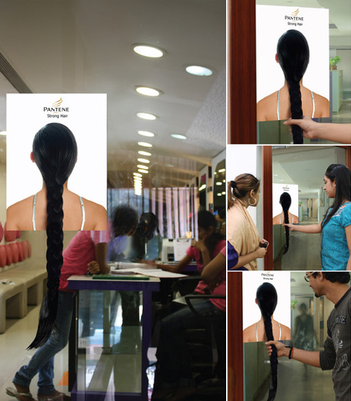
Pantene: Door Handle
Pantene makes a promise of strong hair. A poster with a real plait hanging from the back of a head was stuck on the doors of malls, supermarkets and beauty salons. The plait served as the door handle and each time patrons ‘pulled’ the hair handle, the core benefit of Pantene was communicated in an interesting manner.
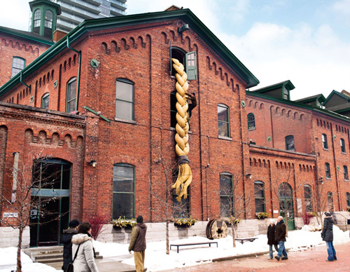
To demonstrate the benefits of Pantene shampoo, professional climbers climbed a giant ponytail attached to a building in Toronto.
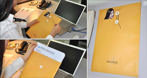
Media establishments received a variety of information on Pantene’s latest products and most recent events in a branded envelope. The string that seals the envelope appears to be coming from the woman’s hair on the flap. To seal or unseal it means putting pressure on the string effectively dramatizing strong hair.
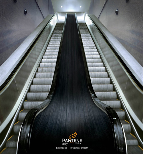
Unusual Pantene shampoo advertisement was placed between two escalators in Shanghai, China.
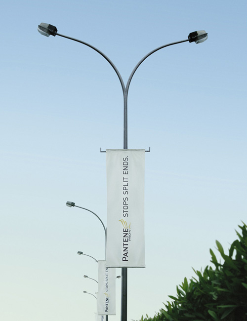
This campaign took advantage of the lamppost shape to express the physical aspect of split end hair.
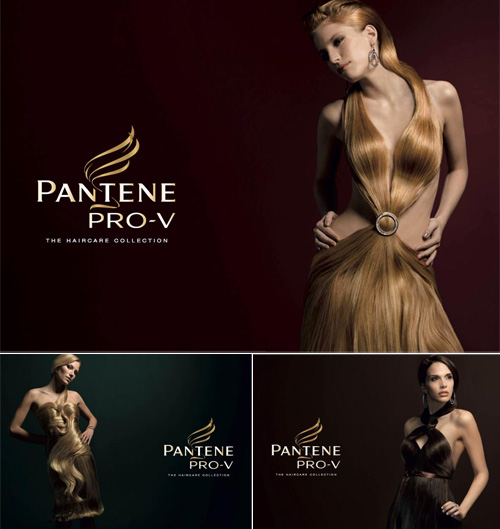
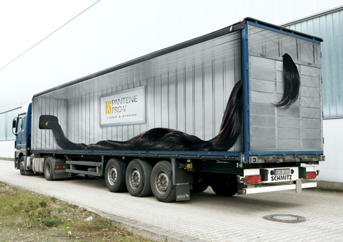
I guess, the hair is so strong and healthy, so you can grow it as long as you want then finally wear it???
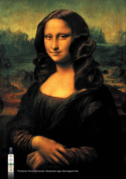
Restores age-damaged hair
I am not very comfortable with this idea. For that is a Serv-safe violation. If you work in a kitchen, you can’t have your hair down. A lack of forethought on the part of the designers. Notice everyone else has there hair up. Pick a more appropriate setting.

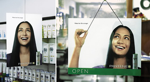
A great “below the line” ad for Pantene done by Grey in Malaysia, Showing a hanging Girl Mobile and a window Sign, that claims “Making hair 10x stronger”. The way they are made, as if they are actually hung by one single hair-line of the girls head looks amazing! It just can’t be ignored without getting your attention.
great pictures of pantene
There are hidden faces on the bottle of the pantene medium-thick 2 in 1