Package designing is useful for Promoting the product features and benefits, process of design and attract the consumers. In today’s modern and competitive retail market world, you only have one chance to make a first impression. Make that first impression a creative and memorable one, with a eye-catching design that will capture consumers attention Soon. In this post, we will present you 20 Creative and Inspiring Package Designs for Drink, which can be an inspiration for aspiring designers. Some of them are still concepts, but they are so special and attractive. I hope I can find them on market one day.
We are a participant in the Amazon Services LLC Associates Program, an affiliate advertising program designed to provide a means for us to earn fees by linking to Amazon.com and affiliated sites.
1. Soy mamelle [link]
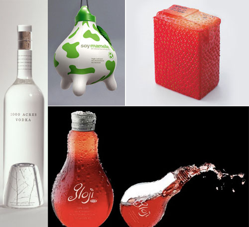
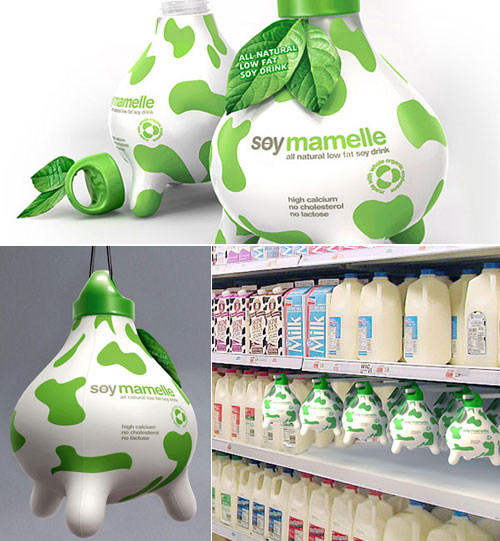
Udder shaped milk bottle designed to help consumers understand that soy milk is just as healthy as regular milk.
2. Juice Packaging [link]
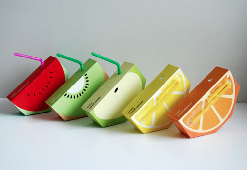
The juice box is shaped in an unconventional way to incorporate the essence of the logo, to gain instant recognition from the audience, and to capture their attention, especially if this product is placed alongside other juices on the supermarket shelves.
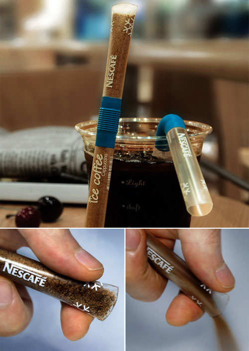
You simply open up the top end of the coffee mixture pouch, pour the contents into water and use the same pouch as a straw for stirring & sipping the drink! Simple and totally worth commercializing!
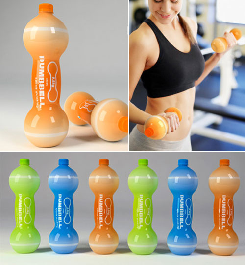
The Dumbbell Sports Drink designed by Jin Le. The bottles can be filled with the water or electrolyte infused sport’s drink, each bottle weight scant 0.5 kg. After you drink it up, you can also fill it into water or sand to make your dumbbells.
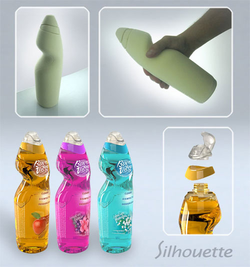
Silhouette: This concept is born on the intent to create an innovative packaging that offers an ideal gripping geometry, a distinctive shape and strong presence at the shop. The novel aesthetic generates a distinctive front and back of the product to satisfy the different aspects of the shop and use experiences.
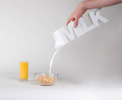
Experiment in cardboard packaging as ell as in communication. It represents the content of the product in the simplest way, both through word and image. The packaging is the same dimension as a 2 Liter milk carton.
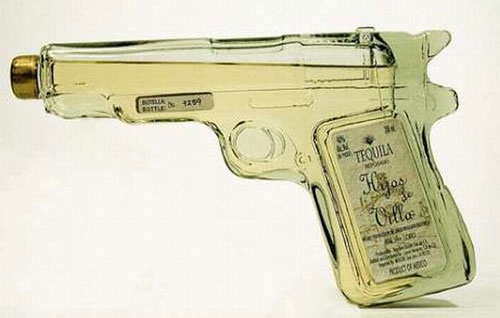
This ‘Tequila Gun‘ looks very similar to .45 but instead of bullets it’s loaded with 200 ml of genuine Mexican tequila.
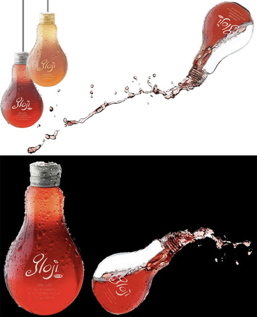
In originally designed light bulb shaped bottle, Gloji drink is all about energy, antioxidants and balanced health. Interesting package makes this product different from other drinks on the market.
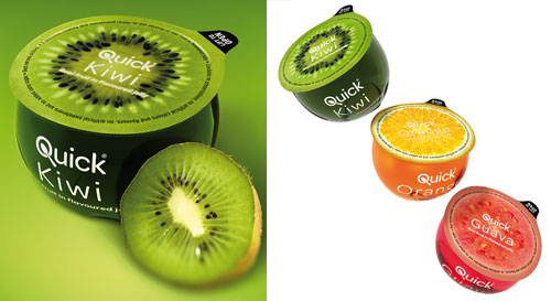
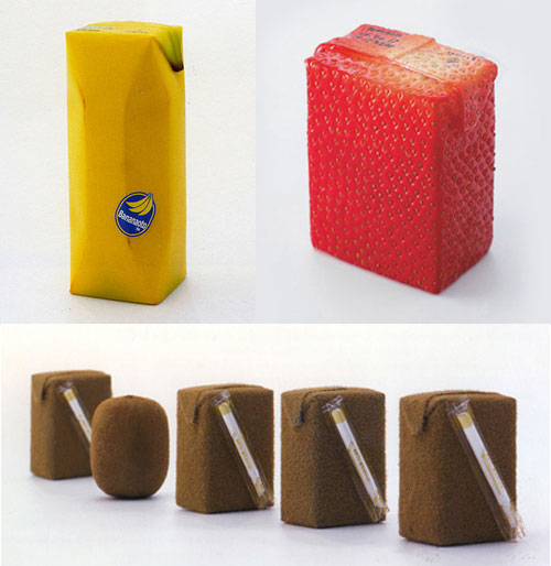
Japanese industrial designer Naoto Fukasawa has created a series of creative fruit juice packages that have the look and feel of the fruit they contain. “I imagined that if the surface of the package imitated the color and texture of the fruit skin, then the object would reproduce the feeling of the real skin.”
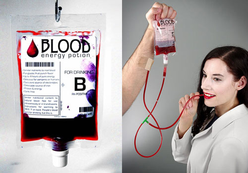
Drinking blood is not just for the undead anymore! Blood Energy Potion looks like real blood and comes in a resealable, transfusion-style blood bag. This fruit punch flavored energy drink is filled with iron, protein, electrolytes, and caffeine.
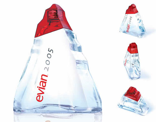
Launched in late 2004 to celebrate the New Year, Evian’s 1-L Origine glass bottle is a monolithic ice-like sculpture. The triangular bottle is a reminiscent of the alpine mountaintops from which Evian water has flowed for more than 8,000 years. The design was handled by Landor Paris.
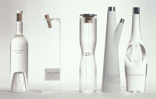
Elegant packaging for 1000 Acres premium Vodka. Glass vessels designed for display beyond the liquor cabinet
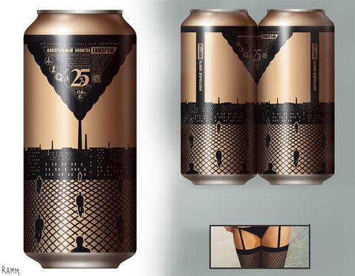
Ramm ND, a Russian designer with a touch of genius designed these sexy pantyhose cans, it makes me want to buy two of those instead of a single can.
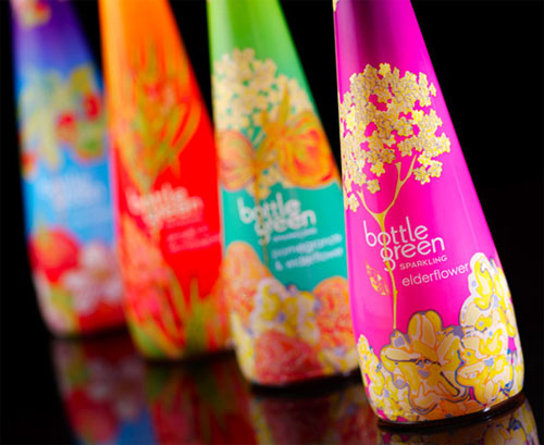
“Premium soft drink brand Bottlegreen is to unveil a range of stylish limited edition sparkling pressé bottles for the festive season, in stores from early November. The designs were created by textile design graduate, Rachel Pitman, following a nationwide talent search by Bottlegreen Drinks Co.”
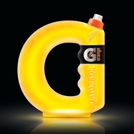
Formed into the practical shape of drink container that so many runners use, it also uses the shape to highlight and emphasise the curves of a G that brings in the brand identity perfectly.
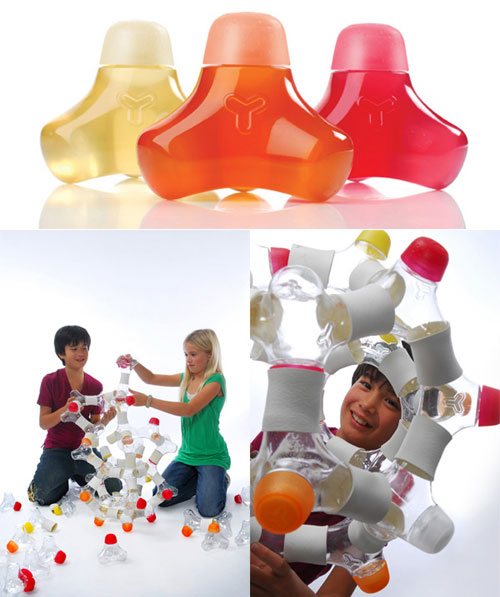
In a similar vein of the wildly popular Vitamin Water, Y Water drinks, which are aimed at kids, are organic, low calorie beverages with vitamins and minerals. Empty Y Water bottles become Lego-like toys with connectors, otherwise known as Y Knots, which turns out kinda of toys for kids as well.
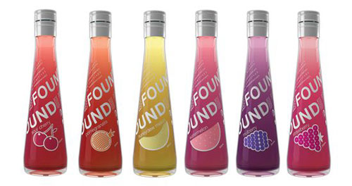
Found has nothing to hide, there is no “back or front” so from any angle the logo and all info can be seen. The bottle shape expresses simplicity and elegance. The tall conical shape almost resembles a perfume bottle, supporting an ongoing proposition that natural beauty comes from within.
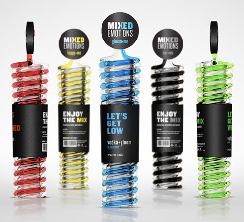
Two tiny mecanisms outline the straws to bottom of the container, allowing air to enter and hence permitting the customer to absorb the liquid. The cap provides an air-tight seal, thus enclosing all openings. While the front panel invites the consumer to drink, the back panel depicts phrases to illustrate the type of experience the customer will encounter. It’s quite a beautiful design!
Some of these package designs are really awesome! I love the Soy Mamelle package, it’s so cute and funny! The Milk pack and the Blood drink are also out of this world! Nice collection, congrats ;)
I`m also bloging about natural juice and the information provided by you is very interesting.
these bottles changed my life
So amazing!