I am not a big fan of McDonald’s, but I have to admit most awesome fast food advertisement I have seen in my life are from McDonald’s. In this post, I will showcase 20 Creative and Smart McDonald’s Advertisement Designs collected from the world. And I am going to find something to eat since I am so hungry after making this post. lol
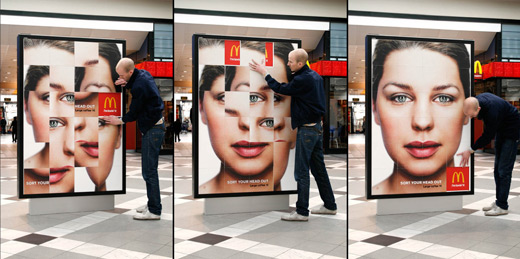
McDonald’s Large Coffee: Outdoor puzzle
Outdoor posters were turned into large interactive push puzzles that consumers could solve in order to “sort your head”. This was done to promote McDonald’s Large Coffee for only 1 Euro.
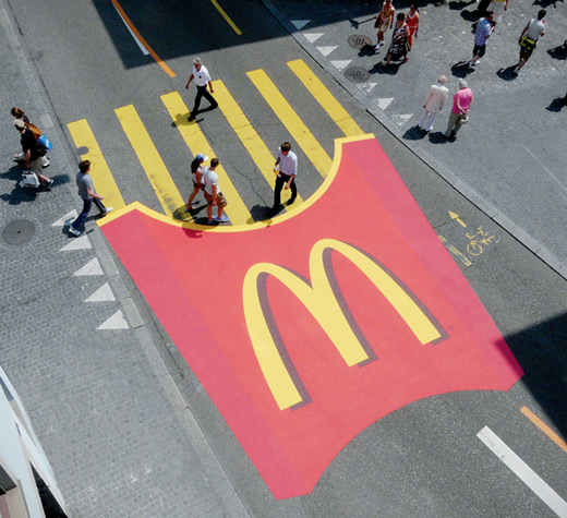
McDonald’s Crosswalk [link]
Pedestrian crosswalk was decorated to look like McDonald’s fries.
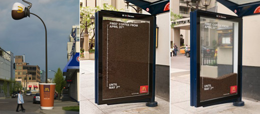
As part of a national campaign promoting McDonald’s restaurants, a downtown Vancouver lamppost became part of an out-of-home (OOH) optical illusion, appearing to pour coffee into a giant cup on the sidewalk. At the time, McDonald’s was giving away free small cups of its brew for a two-week period, in an effort to attract new breakfast customers.
Ad firm Cossette’s Vancouver office developed the concept for a lamppost near 6th Avenue and Cambie Street. The post was wrapped in brown vinyl to resemble poured coffee, while an oversized carafe was attached to the end. Elsewhere in the city, a transit shelter was turned into an ‘hourglass,’ with an ever-diminishing number of coffee beans reminding customers of the promotion’s short-term nature.
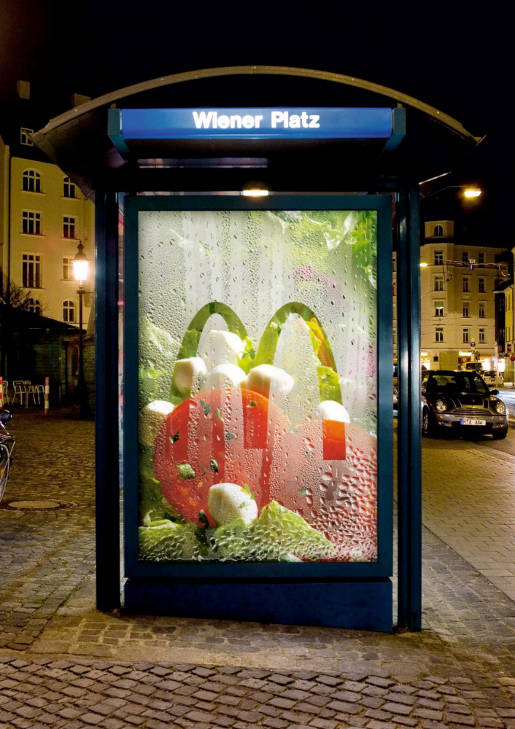
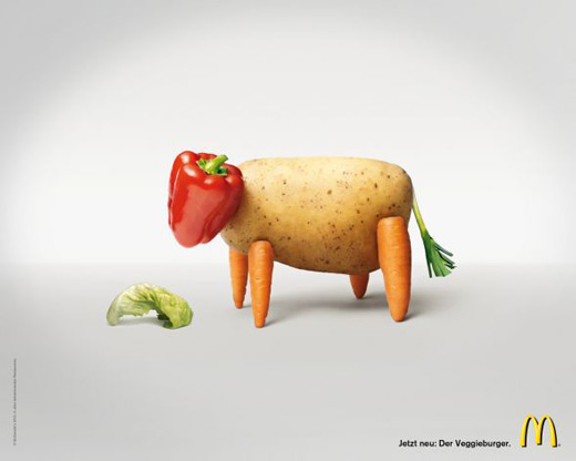
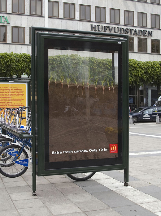
This poster, with what appears to be fresh salad vegetables and condensation, changes a bus shelter into a section in the refrigerator. The poster was placed in Wiener Platz, a place known for its food markets, in Haidhausen, a district of Munich.
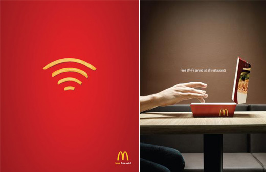
“Love free wi-fi.”
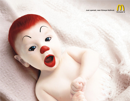
Just opened, near Kimaya Kothrud. I’m lovin’ it.
Honestly, I am a bit scary looking at it.
This one is really brilliant.
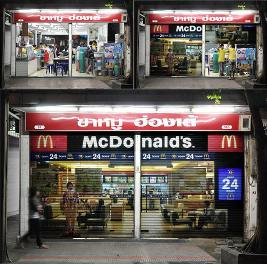
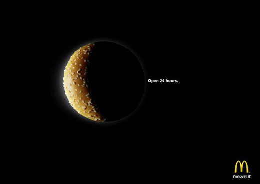
As every restaurants have their closing hours. We feel that this is a great opportunity for McDonald’s to communicate the new 24 hours service. McDonald’s places a night image of its restaurant onto the pull-down shutter of various restaurants. Once the shutter is pulled down after the restaurant’s operating hours, passer-by will see an image of a McDonald’s in late hours. This is to deliver the message that while other restaurants are closed, one can enjoy good meal at McDonald’s 24 hours a day.
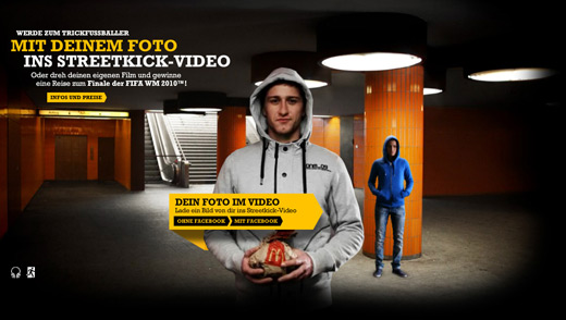
This viral campaign encourages youngsters in a playful way to stop littering the area outside McDonald’s restaurants. To accomplish this we let the users slip into the role of tricky street kickers. They can map their own face into the video and kick the trash in the bin to win tickets for the Fifa World Cup in South Africa.
I looked at the visual… said in my head, “what the hell??”… then read the line and laughed out loud. This is frigging funny and fresh approach. Even though it doesn’t have any typical McDonald’s elements.
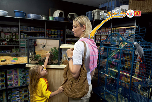
When the kid want something rare(like spider), the mom propose go to Mcdonald’s and the kid forget the spider. It is true: Life for parent can be very hard sometimes. Very nice campaign and love the insight.
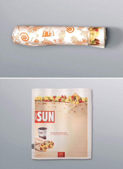
A strategically placed “egg, sausage and chesse” front page domination combined with a burrito wrapper turns your morning paper into a giant McDonald’s Breakfast Burrito. Awesome use of media!
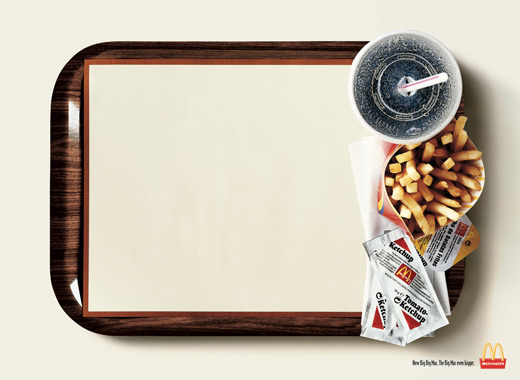
This one, will always be GREAT! I really enjoyed. And so smart to think M looks like a fork in this case ;)
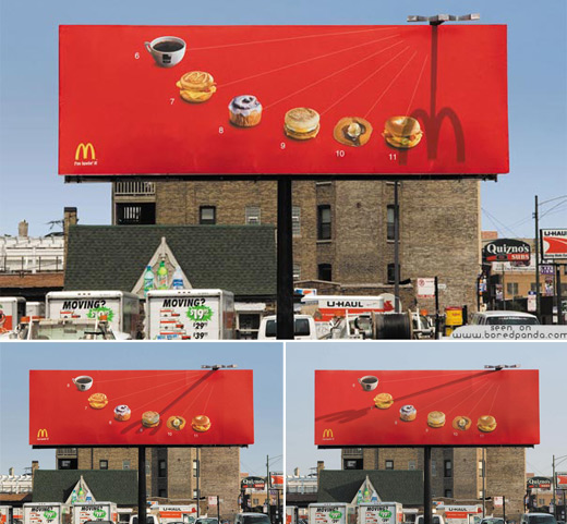
This is cool, even if it will never be on the exact right spot, people will at least try to place it just for the fun of it. Nice idea.
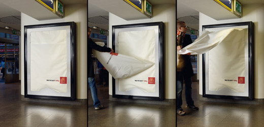
Economically it’s a great idea. Any time you can get someone to take the ad with them and show it to their friends is great. Yes, this idea cost a little more then a regular poster but it will generate ten times more attention
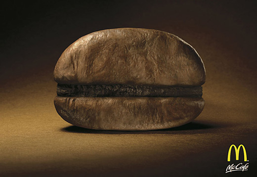
I would have never known it was a coffee bean without the title, it looked more like an old crusty burger to me. I think this is really smart. Very clever indeed. But the first thing in my head is “Ew! Gross burger!…. oh, coffee. cute.”
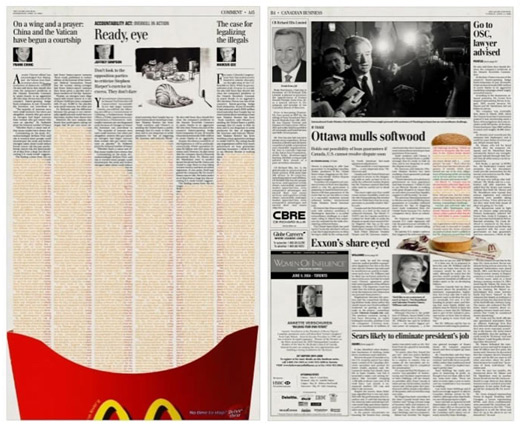
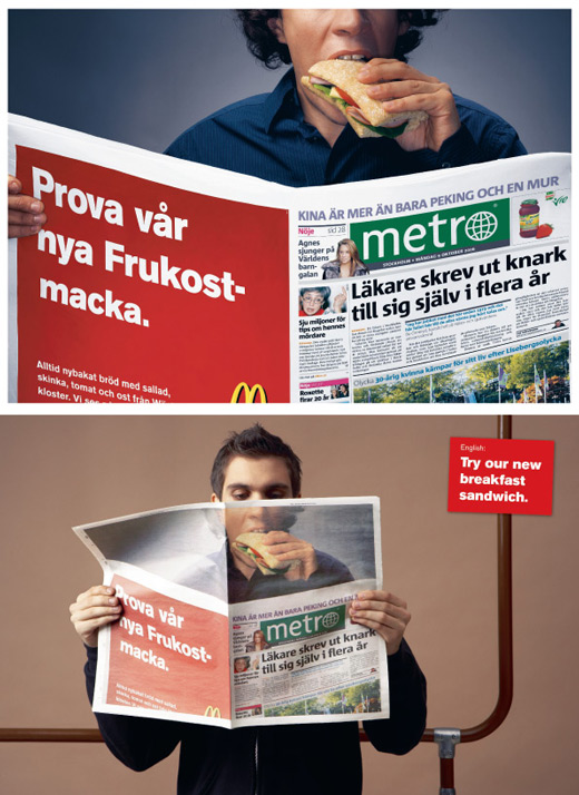
The idea here was to keep McDonald’s front and center, in a multi-tasking world. The articles are real. Just color was added. By fitting into the target’s activity (reading the news), rather than interrupting it, the “on-the-go” brand benefit was demonstrated.
