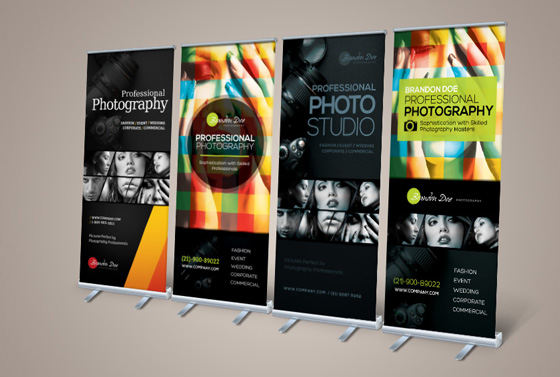
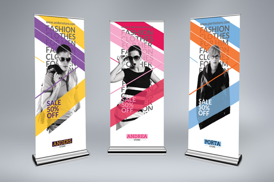
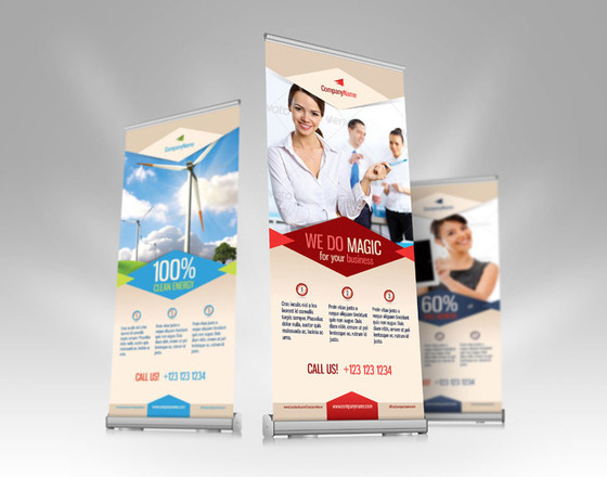
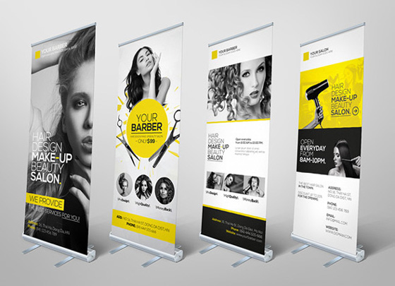
Print banners are often deployed at events and locations where a large number of people are gathered to do something, such as conferences,
seminars, concerts, athletic events or trade shows, or in front of your store when you launch a new product, promotion or service. To make sure your banner stand out among others, your banner design has to be striking enough to garner the attention.
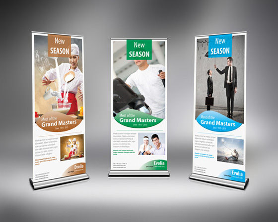
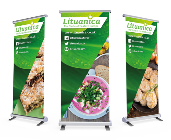
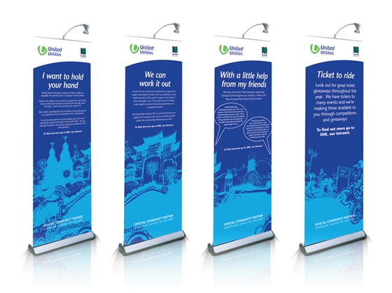
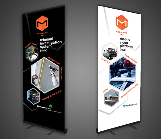
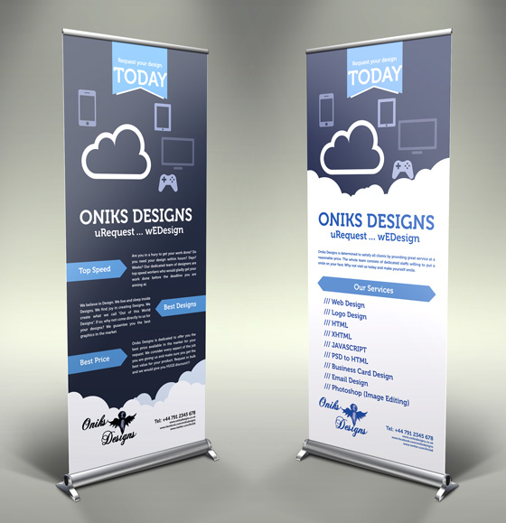
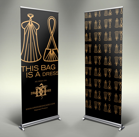
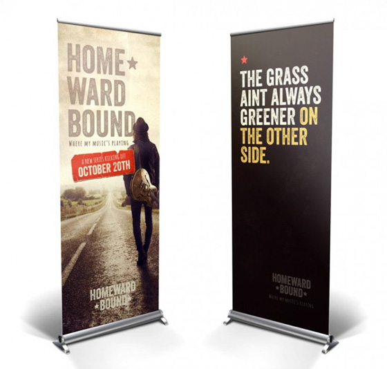
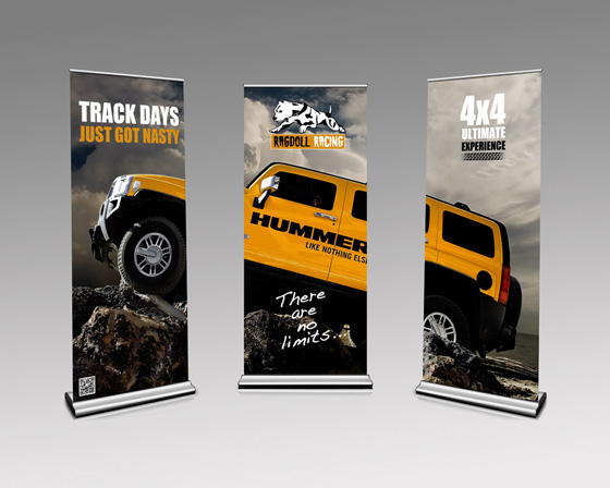
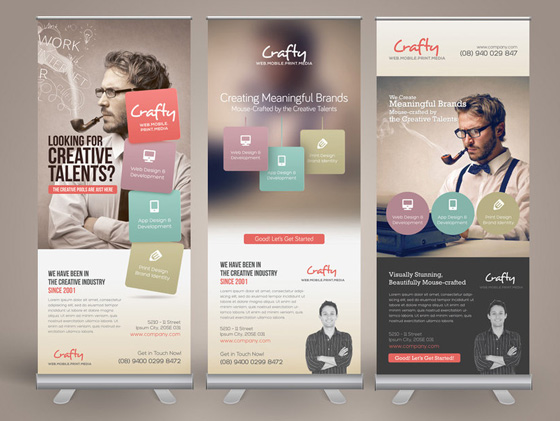
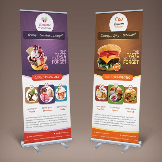
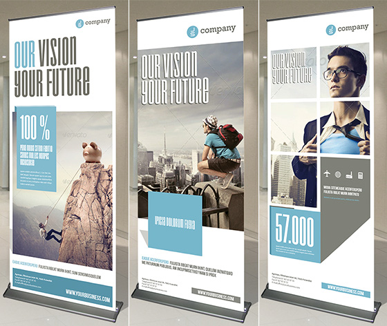
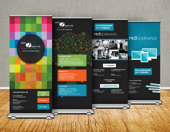
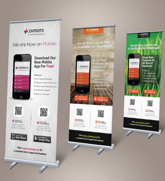
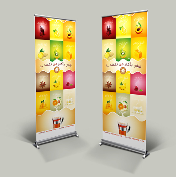
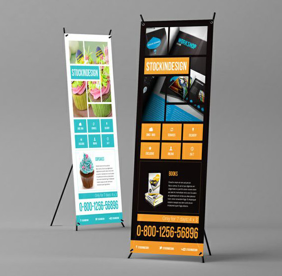
There are many factors you need to consider before creating a banner, such as: indoor or outdoor? hanging or standing? vertical or horizontal? target audiences?viewing distance? And today we will focus on vertical banners which are designed to stand out for your business, whether at a trade show, special event, or right outside your storefront. Different from the horizontal banner, you have plenty of height to work with. Hence, remember to spread your text out along the length of your vertical banners to get better readability and impression. (Fonts can make a big difference to the impact of your sign – see this series of articles for more on fonts.)Here, we rounded up some inspiring vertical banner designs. Hope you can get some ideas for your next banner print. Enjoy!
