Food boxes should always echo your brand’s identity and style. This way, you can impress your customers and engage them in an unforgettable experience. Food packaging is a great deal in the culinary industry, and the demand has been growing considerably due to the COVID-19 pandemic.
That’s why brands use countless methods to capture the consumers’ attention, including excellent, innovative, and sustainable design. Read more here. With that said, here are four examples of killer designs for paper food boxes!
#1. Minimalism
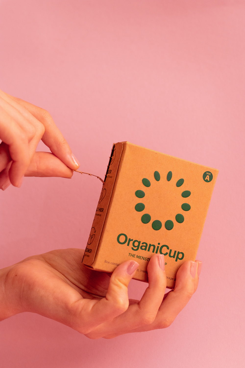
The ultra-creative spirit has taken the industry by storm, making it harder to wow consumers with your design. The evolution in design tools and printing methods has led to endless possibilities regarding packaging food. At a time when the competition for consumers’ attention is fierce, you can choose to create a minimalist yet robust design. Find the perfect group of fonts that harmonize your branding and logo.

#2. Patterns
Most consumers buy products that align with their lifestyle and tell a story. Bring your clients behind the scenes using a design that speak to them.
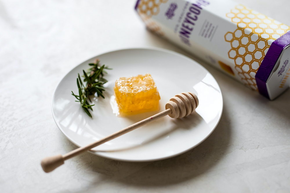
You can easily make your food packaging design stand out using patterns. There are various ways to implement patterns and make a difference. They will be the first thing your customers will see, helping carve their thoughts of your brand and product. Whether you choose minimal patterns or colorful ones, they are a great option if you customize a food box for sweet products.

#3. Rustic
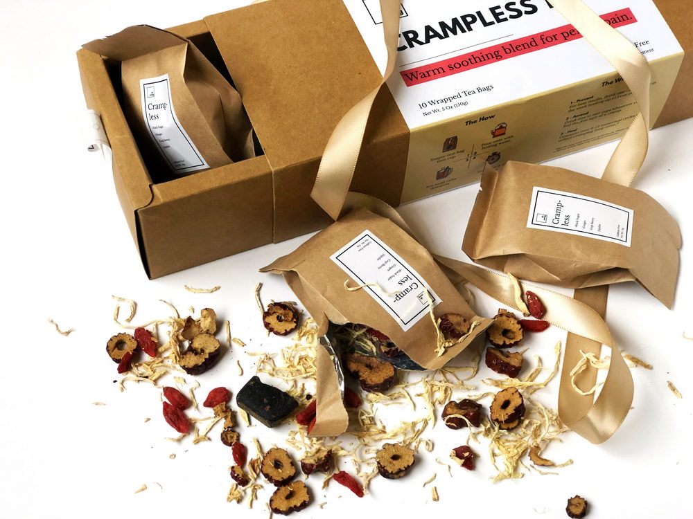
Rustic style has always emphasized rugged and natural beauty to attract potential customers. Most companies use rustic food packaging, reminiscent of rural life and being at one with nature. Usually, the philosophy behind a rustic design is that less is more. But putting aside the emotive ways the rustic style influences your customers, you can create biodegradable and sustainable customized food packaging.

If you think a rustic style shares your brand’s identity, use warm and wooden colors to implement your logo and tagline. To create a rustic design, go for warmer shades of brown, beige, milky white, or green.
#4. Illustrations
There’s more to creating a unique packaging design than using attention-grabbing colors. Food packaging is a medium that must resonate with your branding while explaining your identity, the value of your product, and the uniqueness of your food. While it may seem challenging, choosing the right design can leave a long-lasting impression on your customers, who might decide to return to you.

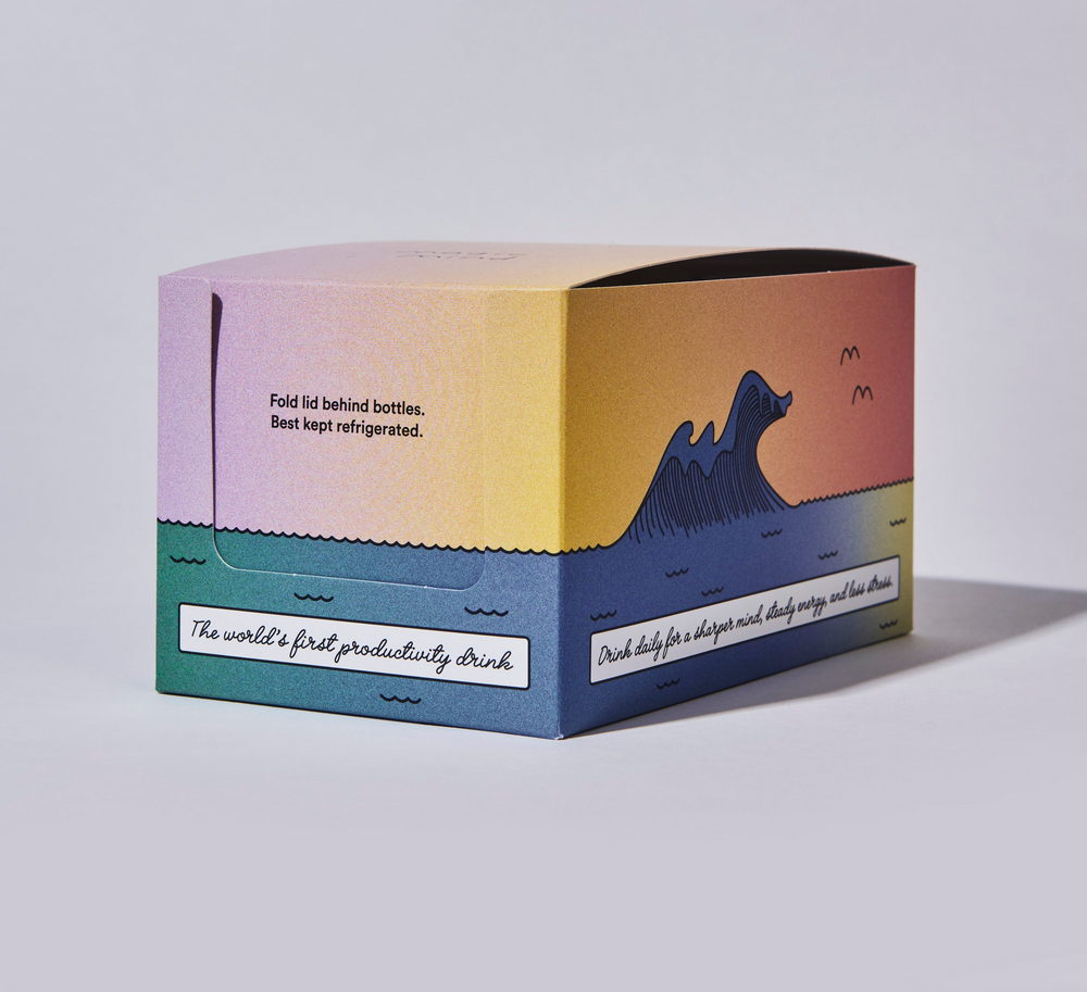
In a sea of food photography, a bright illustration may stand out. You can either illustrate your products or its ingredient to reinforce your brand’s voice and story.
Why Choosing Custom Food Packaging is Right for You?
Food packaging should explain why your products differ from a consumer’s current favorite. Undoubtedly, custom packaging design is proper marketing. So regardless of your products, your food packaging should tell the customers why they should buy your products and that they made the right decision.
When deciding on the design of your custom food packaging, keep in mind that your design will communicate the value of your product to your consumer. So, take your time deciding the imagery and colors you’ll use and the shape of your food packaging. Always consider the packaging material, printing options, sustainability, shapes, storage, and visual design, and your company will stand out from the crowd for sure.