Building a retail store is challenging. No matter how great your products are, if people aren’t entering your store, you might not be able to generate enough sales as you’d hope to be. One way you can attract customers into visiting your retail space is by making your area enticing and exciting. With more customers inside, you can increase your chances of having more income for your business.
Depending on your products, you should design your retail store accordingly. You can look for inspirations online, or you can visit Soho retail space and be able to see various rooms that can match your branding along with your target audience. Moreover, listed below are the visual design tips you can implement for your retail space:
1. Be Creative On Your Store Front
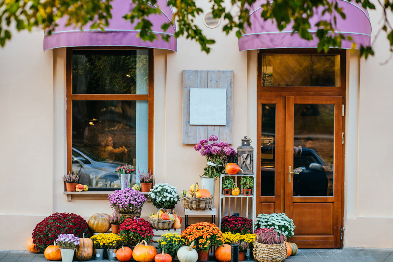
The first thing people will see in your retail space is how you design and present your storefront. If your area has a dull appearance, you’re not attracting many customers as you’re supposed to be. No one finds a plain retail store to be enticing to look at. However, if you design it to be creative and match your target audience effectively, you’re inviting more people to come and see what’s inside.
To catch people’s attention when they pass through your store, you should try to be creative with your storefront. If you’re selling sports attire, you could add sports equipment on the ground along with a sporty background. In this way, people will no longer have to guess what kind of clothing you sell when your store shouts for it.
Moreover, you could try experimenting with other outfit choices that create a fashion statement that’ll blow your customers away. You’ll never know the potential of a plain t-shirt once you mix it with other statement pieces.

2. Build Experiences
If you’re selling a product that may require your customers to use them on their skin, you may want to create a station wherein they can have a look and feel of the product itself. No one likes to purchase an expensive hand soap to find out that it produces an awful scent along with a dry texture. To allow your customers to set their expectations about your product, a creative hand washing station would be helpful. You could set out all of the scents and styles available. Just ensure that they’re free to use.
Apart from cosmetic and hygienic products, if you’re selling items that your customers need to use, you should provide a space wherein they can touch, look, and use them. If you’re selling mobile phones or headphones, it would be great to arrange a table wherein you line up all of your items and allow the customers to use them at their own will. Just ensure that you implement enough security features to disallow other people from stealing them.
3. Refresh Your Store
A store with poor lighting might imitate the idea of closing up real soon. It can also give the opposite impression of inviting as it has dull lights that may not be enticing to look at. To draw more people into your store, you should consider refreshing your lights into something more alive and livelier. In this way, people would immediately know that you’d like customers to come in and you’re making a good sale.
If you’re not a fan of white lights since they can be too bright for your eyes, you should consider adding warm colors to add calmness and luxury. You can play with how you’d like your lighting would be. You could choose to add track lights, cove lighting, and even a chandelier if you wish. Just ensure that you add lights and colors that adhere to your product and branding and create the perfect balance.

4. Don’t Limit The Interior Of Your Store Front
While you may want to focus on attracting your customers to come inside your store, you should balance the habit by allowing your shop to continue to be enticing on the inside as well. No matter how creative you are with your storefront, if the interior of your store is dull, people might not be motivated to stay inside your store for a while.
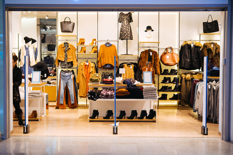
Ideally, you should decorate the inside of your store as well. You should stick to your theme and implement it in the whole area. If you’re going for wood and white, you should fill the racks with those colors so you could have a fluid look for your store. If you’re having trouble maximizing your creativity, you could hire a store designer, and they could even help you with how you should place your aisles effectively.
Apart from the color scheme of your store, you shouldn’t forget that decorations matter. You could hang banners, plants, mirrors, and paintings on your walls to fill in any blank spaces. Just ensure that you don’t overcrowd your store with decorations as most of your store should be the products you sell.
Conclusion
To increase your sales, you need more people to look into your products. However, if your store isn’t enticing to even look at – moreover to visit, you should do something about it and avoid putting yourself into bigger debt.
With lots of inspirations online, you should be able to look for the perfect theme your business can use. Just ensure that you create a perfect balance of everything and allow your design to align with your branding.