A memorable logo is one that is instantly associated with the company it represents. Think about powerhouse companies, like Apple, Nike or Starbucks. Their logos are practically synonymous with their brands. This just shows that the right logo goes a long way in helping consumers recognize and differentiate brands.
Whether you’re creating a new logo or upgrading an existing one, being aware of today’s popular logo design trends may give you a competitive edge. Once you know which trends to follow, you can hire a designer or choose a logo maker, such as the one offered by Wix, which is an easy and affordable way for freelancers or small business owners to create a trendy, beautiful logo without having to hire a professional designer.
Let’s look at why logos may need a periodic makeover and 5 popular logo design trends to consider.
Why it’s important to update your logo
A logo is the face of a company, but that doesn’t mean its looks can’t change. Over time, companies (and their values, products and services) evolve and, as a result, so do their branding efforts. Look at Fortune 500 companies, like Google, Instagram, and Coca-Cola, who have all updated their logos to stay relevant.
Refreshing your logo could help spark more brand awareness and boost consumer attention. After all, memorable logos are 13% more likely to get consumers’ attention and 71.6% more likely to get a positive response from consumers. Not to mention that with today’s reliance on mobile, branding efforts need to be designed with the digital landscape (i.e., smaller screens) in mind.
5 top logo design trends of 2019 (so far)
1. Bright colors
Color has long played an important role in logo design, as color psychologically impacts how people view the world. In fact, colors, especially bright colors, subconsciously influence consumer behavior. For example, a University of Loyola, Maryland study found that color increases brand awareness by 80%. This is not surprising given that when it comes to brand recognition, color is the first thing consumers remember, followed by shapes, numbers and then words. In a study by the CCI: Institute for Color examining the effect of color on sales, 92.6% of those surveyed said that color was the most decisive factor when judging products.
Bright colors are prevalent in today’s logos. Bright red inspires passion, power and excitement. Orange is playful. Electric yellow exudes youthful energy, adventure and enthusiasm. Bright blue elicits trust and maturity. Meanwhile, black is sleek, modern and luxurious. No matter what color best represents your brand, go bold.

2. Illustrations instead of letters
Today, especially among Millennials, text messaging and emails are more popular than conversing over the phone or face to face. Therefore, it’s only natural that more and more companies are opting for text marketing strategies in order to reach their audience immediately. As a result, emojis have even replaced text-based conversations. Therefore, as a result companies are incorporating illustrations into their logo designs. Logos that substitute letters with illustrations are appealing to a wide variety of consumers. However, this style may not fit every brand; it may be too cute for traditional or high-end companies. It’s also important to be sure that your logo is still readable with the illustration. No logo is effective if it’s misunderstood.

3. Negative space
Using negative space in a logo to relay a message is not a new trend, but it remains big this year. Logos that use negative space to creatively hide an image, shape or text can add an element of sophistication. Take the renowned FedEx logo, which uses its negative space to create an arrow between the “E” and “x,” signifying the company’s mission of transferring items from one place to another. The added complexity can make a simple design more memorable. Once viewers discover the hidden meaning, they may generate buzz about it, thereby increasing brand awareness for it.

4. Gradient design
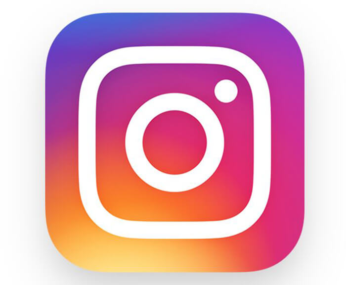
The use of gradient design , also referred to as color transitions, continues to be trendy this year. This technique gradually blends one color to another, though it’s not limited to just two shades. Using the gradient design enhances flat logo designs and adds both color overlay to photos and texture to backgrounds. This logo design technique was popular until the late 2000s but made a comeback in 2018 when Instagram adopted the trend for their logo update. Ever since, this logo design is seen everywhere. And it’s no wonder, given how versatile it is. Gradient design can be bold or subtle. It can blend similar or contrasting colors to produce unique designs that are modern, retro, calming or vibrant. This technique creates eye-catching logos whose designs and color combinations stand out.

5. Metallic Designs
The metallic look is also not new to logo design, but it remains in-demand this year. No longer reserved just for jewelry brands, metallic logo designs are prevalent. Whether platinum, gold, or rose gold, these elegant logo designs relay a level of prestige, with their shiny metal effect, and make the simplest of designs stand out. Though associated with high-class luxury, today’s broader use of metallic logo designs has made them accessible to all kinds of businesses.

While seemingly small and symbolic, your logo plays a big role in representing your business. It should be instantly recognizable as the face of your company. No matter what design technique you use when creating your logo, the end result should embody and strengthen your brand. For the best success, consider using elements of the five popular trends in logo design for 2019 that we’ve listed here.