There are literally thousands of websites out there vying for attention. With more websites added every day, it may seem like an impossible endeavor to grab attention. However, with the right web design, anything is possible. Taking a step back to analyze the website you want and the way you want it to look can help you to get everything you’re looking to achieve out of your site. Here are eight examples of how you can create a website that grabs attention in a good way.
Reduce Scrolling
Scrolling is common on any website so the user can get to the rest of the information. However, websites are getting out of hand with scrolling effects and it is causing users to slow down. Through the use of content concentrating on quick consumption, users are able to see more of what they want without scrolling. You retake the ability to have an effective site that is easy and fun to interact with and use. The overall effect on the design is a website that is attractive and more user- friendly. It is a necessary component in a world where visitors’ attention spans are decreasing by the day.
Responsive Design
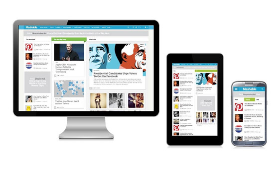
Not all people are using their desktops to access your site. In fact, more people than ever before use their smartphone or tablet to access sites. A responsive design means your website is viewable with equal effectiveness on any device, from your smartphone to a wide screen monitor for your desktop and since mobile commerce is on the rise; therefore it makes all the more sense to go in for a responsive design. The key is in the manipulation of the code so the screen resolution is detected and the display is automatically altered. Zero downtime ensures that your website remains accessible to all users, no matter what device they are using. You should entrust this job to a Web Design Agency with experience in the field because they can implement responsive design strategies effectively, ensuring a seamless experience across all devices. With their expertise, your site will be optimized for mobile and desktop users alike, providing a consistent and high-quality user experience.
Grid Layout Design
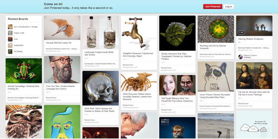
In keeping with the concept of short attention spans, many are using the grid design, made famous by Pinterest. This design allows you to use less space on the page while still offering coherent content that is ultimately easy to skim, according to Hongkiat. Condensing into this format can make the site look like an infographic. Users skim through looking for interesting pictures, headlines and content and click on the items they want to investigate further.
Video Players in HTML5
Video is the ultimate way for visitors to embrace their short attention span. Rather than reading hundreds of word of content, they simply watch a video. Embedded into the website, no one leaves the site, so you don’t have to worry about recovering them. Once finished, the video can lead to other videos you might want them to watch. In some cases, your visitors might not need to go anywhere else on the site to learn about your company.
Make Your Words Interesting
Everyone in the industry knows that content is king, but did you know that how you present the content is just as important? Rather than using a standard serif font, The Next Web recommends using more interesting fonts to add personality to your website. The font says a lot about the nature of your content and the whimsy of your business without anyone ever having to read a word. Some people just take one look at a page littered with boring looking fonts and get a headache just thinking about reading it. Make the font more interesting and there’s a better chance it will be read.
Keep it Simple with Flat Design
Overthinking your website design can lead to a lot of trouble. Think about the design of the screen on your iPad as a cash register. The apps lack shadows and gradients once popular throughout every web design. The effect is simple, stunning and engaging all at once. Utilizing the same effect on your website allows your visitors to concentrate more on your content than on your digital effects.
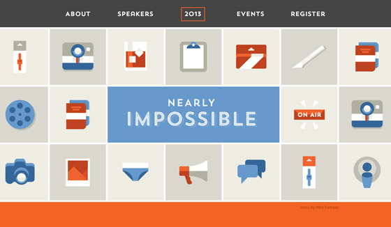
Image Designs
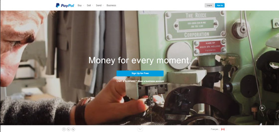
The background of your landing page, or any page, should engage your visitors. Thanks to faster loading speeds, the availability of higher quality images and more affordable prices, according to 99 Designs, the use of images on websites has become extremely popular. Even PayPal, a massive site, utilizes moving images in the sign-in page as a background. Put your visitors in the right mindset by getting rid of the content and by embracing images.
Parallax Designs
An emerging design still growing in popularity is the parallax design. This design is intense in imagery and interactive capabilities. The stunning graphics in place allow the user to feel involved with the website. Big brands are starting to use more of this design, but as with anything, it will certainly transition into mainstream popularity before long. Developing a site that uses this kind of design will allow you to set yourself apart from smaller companies, even if you are one. All of these designs are amazing ways your website can be everything and even more than what you wanted.
