

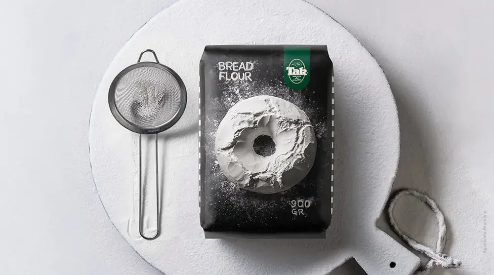
Backbone Branding has transformed the packaging of “Tak” flour, creating a design that enhances its shelf appeal while preserving the brand’s identity and recognition. The goal was to make “Tak” flour stand out in a market where flour products often lack variety and unique visual appeal.
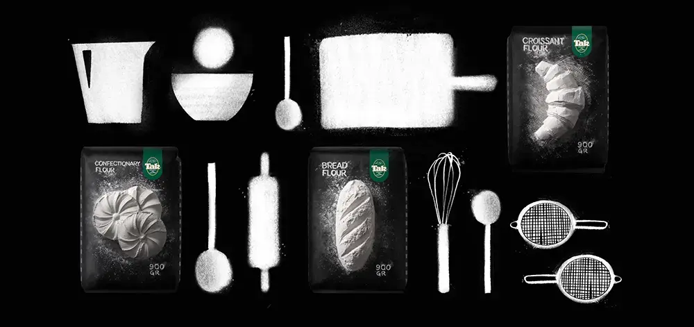
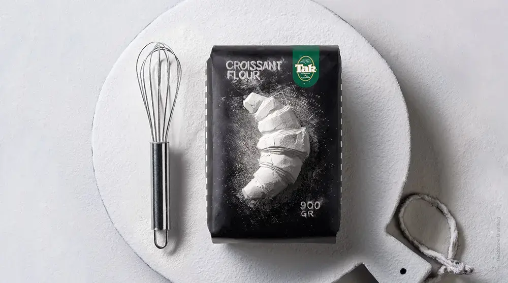
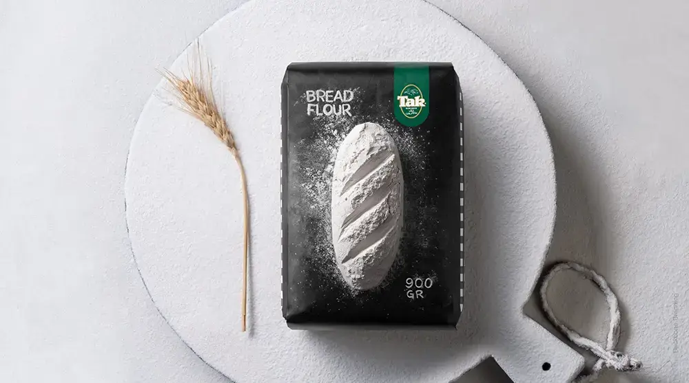
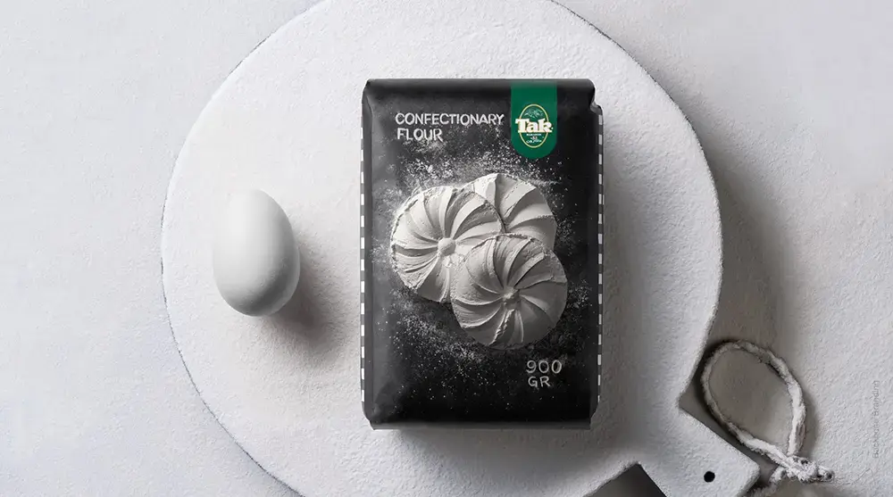
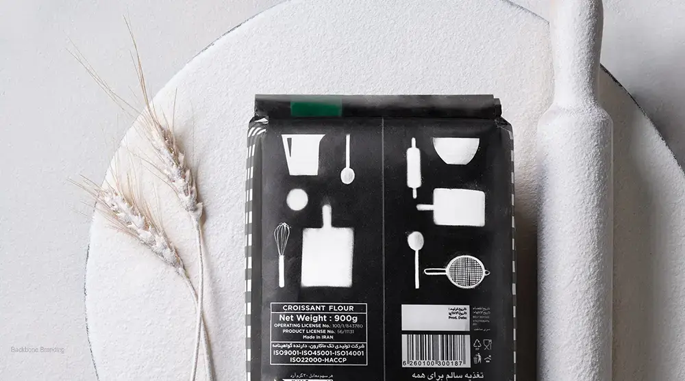
To achieve this, Backbone Branding developed distinctive packaging with bold, black backgrounds that serve as a canvas for artistic illustrations. The designs prominently feature sculptural shapes of popular bakery items, such as bread and croissants, crafted from flour. These visuals evoke a sense of craftsmanship and artisanal quality, giving the product a unique personality that immediately grabs attention on the shelf.
One of the standout features of the new design is the prominent placement of the “Tak” logo. This ensures strong brand recognition, helping customers easily identify the product. The familiar brand pattern along the sides reinforces its identity while blending seamlessly with the new artistic elements.
By merging art and branding, Backbone Branding successfully made “Tak” flour not only visually appealing but also easily recognizable. This innovative approach sets “Tak” flour apart from its competitors, providing a fresh look that draws in customers while maintaining the product’s established brand recognition.
In a market where flour packaging can be monotonous, Backbone Branding’s creative strategy has given “Tak” flour a distinctive edge, ensuring it catches the eye and stays memorable.