eCommerce web design plays an important role when you build an online store because over 70% of website credibility and first impressions stem from design. If you do it right, sales and customer growth can increase.
This article will show you the best eCommerce website design examples from multiple industries and cover key takeaways to implement in your eCommerce business.
1. Glossier
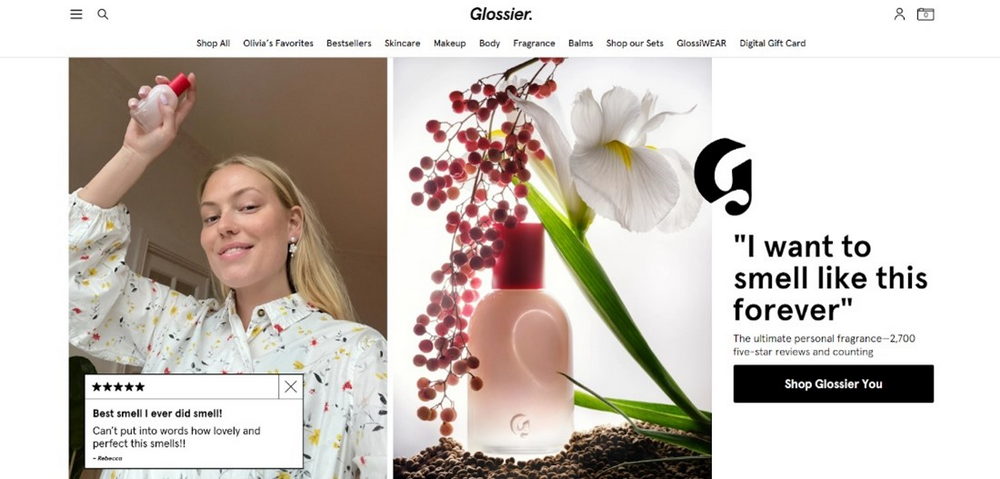
Fashion, design, and makeup brands can take Glossier’s eCommerce website’s design as an example. This eCommerce website takes a minimalist approach with high-quality photos and ample white space to ensure website visitors focus on key selling points.

On the product pages, the brand displays product images from multiple angles and shows how they look on different skin tones. This presents inclusivity and helps customers make purchasing decisions, which quickens the buying process.
Takeaway: Improve your company website by using high-quality images to attract the target audience to your products.
2. re_
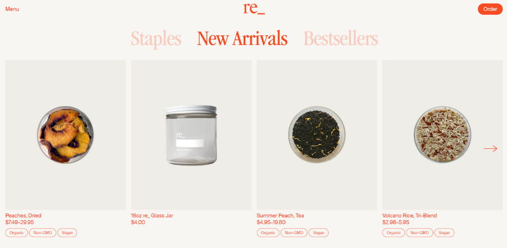
re_ is a Los Angeles-based sustainable grocery store. All of its products are organic and use reusable, plastic-free packaging. Besides the eco-friendly principle, this online store’s user-friendly navigation can also be a great reference.
When visitors click Order, it directs them to a specific customer journey – order delivery or pickup. After that, they’ll see a page containing the best-selling items and links to essential pages, such as FAQs and product categories.

Moreover, this great eCommerce website design applies a monochromatic color palette – white and different shades of orange – making the product photos stand out.
Takeaway: Understand the customer journey when planning site navigation to deliver a good online shopping experience.
3. Ban.do
A good eCommerce website design doesn’t have to be minimalistic to succeed in selling online. Take a look at Ban.do, a lifestyle eCommerce store integrating a playful theme with vibrant colors.
Its homepage uses colorful illustrations for the sale banners and product categories. Ban.do also applies this youthful theme to the product photos and some elements in the product category pages, making the look and feel consistent across the website.
Takeaway: Design the website according to your brand personality and ensure consistency.
4. ByNext
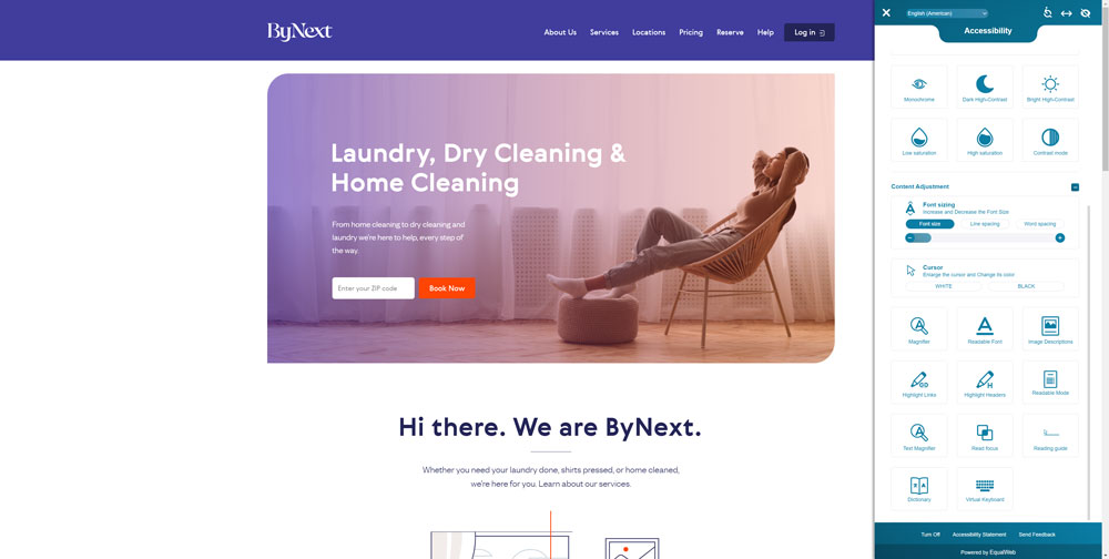
If you’re looking for inspiration on how to design an accessible website, ByNext is a good starting point. Its online store has a customizable accessibility tool to make shopping online easier for users with disabilities.

This tool lets visitors adjust the navigation, colors, and content, such as increasing the font size or enabling keyboard navigation. It also uses a responsive design and works well on mobile devices.
Takeaway: Think about website features that can improve the shopping experience and check whether your eCommerce platform has accessibility tools.
5. Meller
Great eCommerce websites have social proof that makes the business trustworthy. This may include user reviews, certifications, and celebrity endorsements.
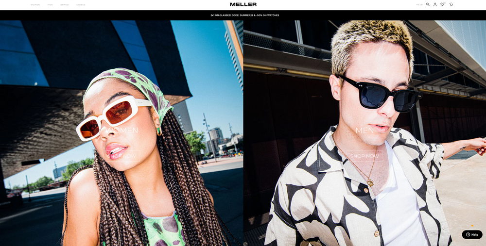
Meller is an excellent example of this practice. This fashion eCommerce store integrates photos from existing consumers wearing its items on every product page, helping the brand prompt potential customers to buy it.

In fact, 90% of people agree that user-generated content influences their purchasing decisions, even more impactful than influencer posts, promotional emails, and search engine results.
Takeaway: Show social proof, especially user-generated content, to increase credibility and sales.
Conclusion
Attractive eCommerce design is essential to make a good first impression and build credibility. This article covered five excellent eCommerce website examples and key design takeaways you can implement in your online business:
- Glossier – use engaging product images.
- re_ – plan the customer journey.
- do – inject your brand personality.
- ByNext – improve the shopping experience.
- Meller – display social proof.
To summarize, good eCommerce stores should have excellent photos, seamless navigation, and design consistency. Complying with accessibility guidelines and displaying user content can also maximize results. Good luck!