Probably you’ve seen already the 2009 AT&T “hands” campaign, which is designed to promote AT&T’s wireless international roaming. While these images have been around for some time, I recently received another email with some new designs. So I decide to write a post about this creative collection. In all of them, human hands are shaped and painted into the colors of different countries. Guido Daniele is the artist behind this awesome set. This is one of the most innovative advertising design I have ever seen. I hope I can see more and more poster printing like these, which grabs your eye and full of entertainment.
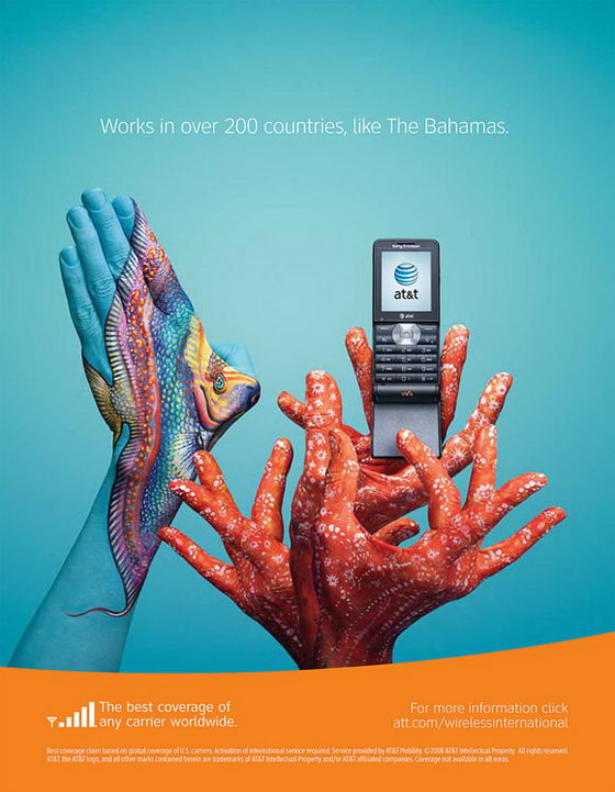
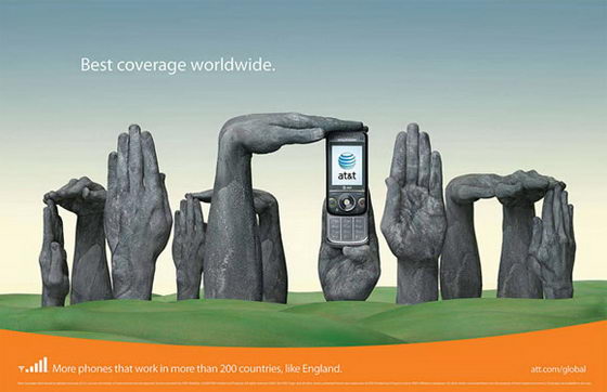
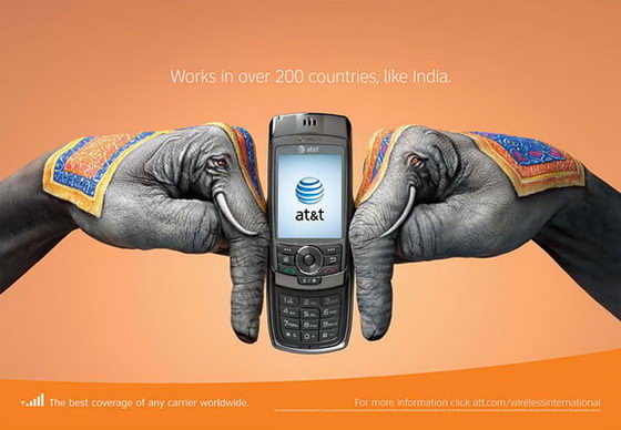
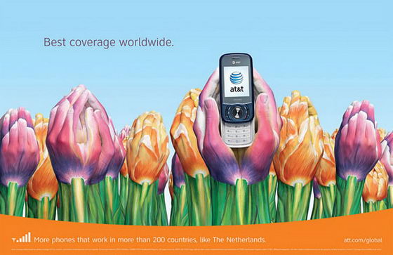
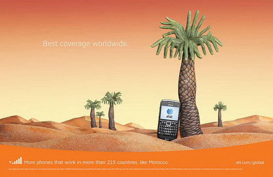
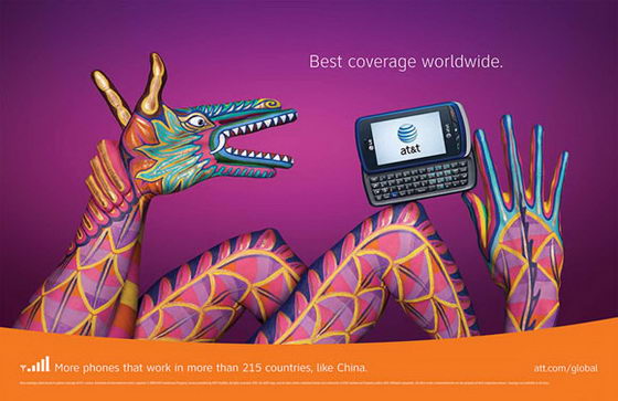
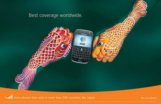
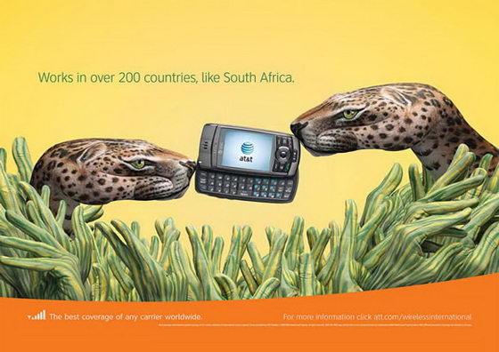
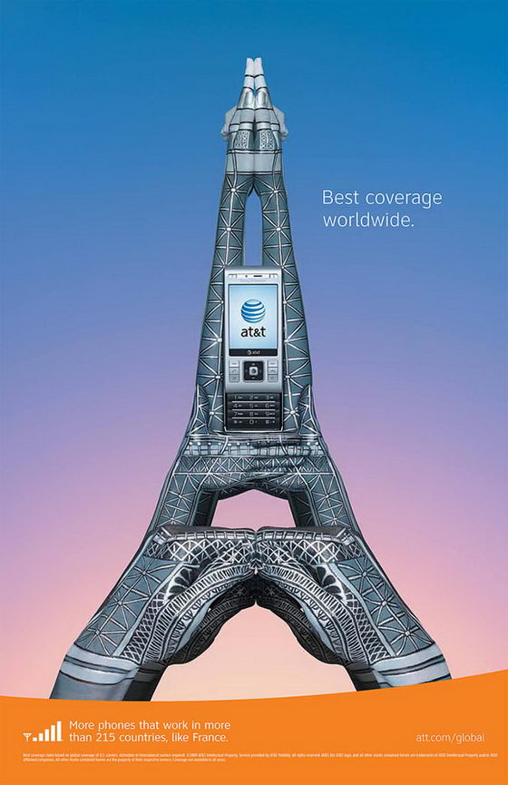
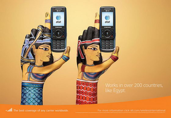
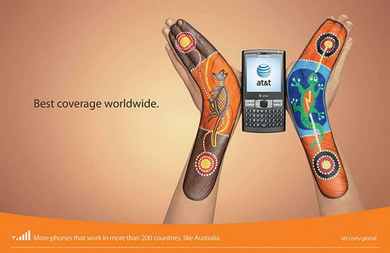
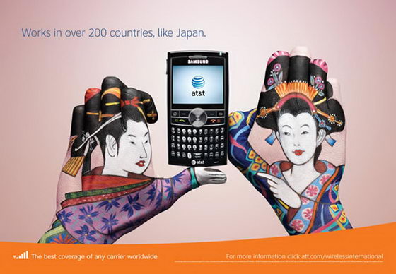
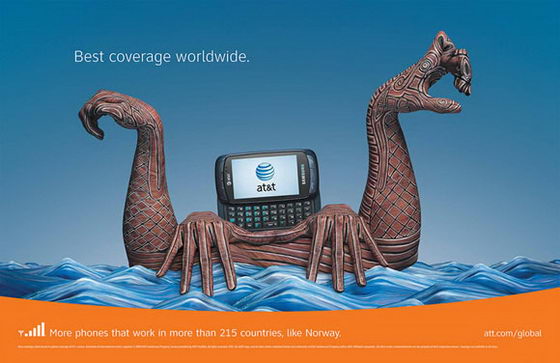
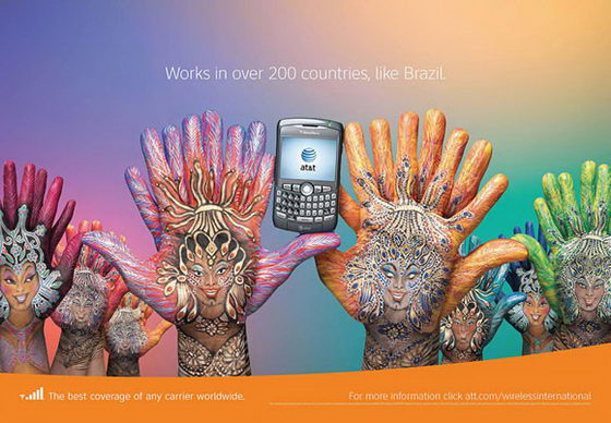
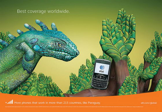
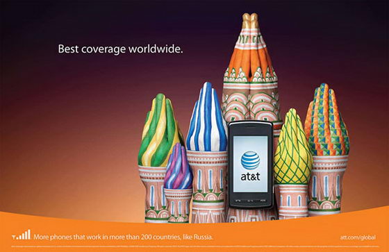
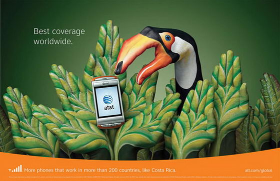
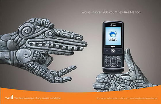
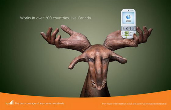
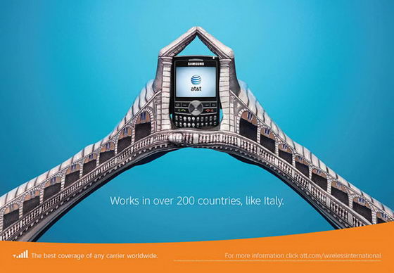
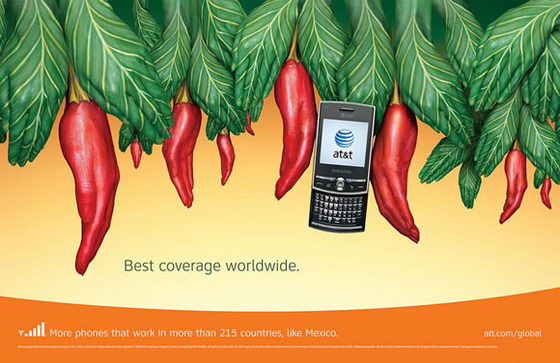
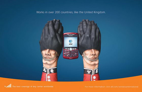
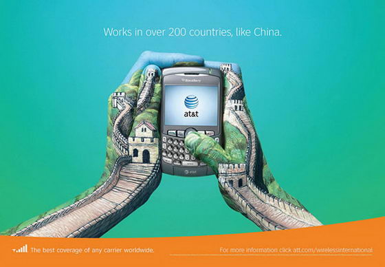
These ads look great! One of the most creative campaigns I’ve seen!
Hi, I agree that the ads look great and are very creative, but I wish people would get their Geography right.
England is not a separate country on its own, and the United Kingdom is not depicted by the Queen’s guards!!!
England, Scotland, Ireland & Wales are the United Kingdom.
One of the most creative artwork ave seen!