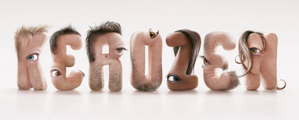
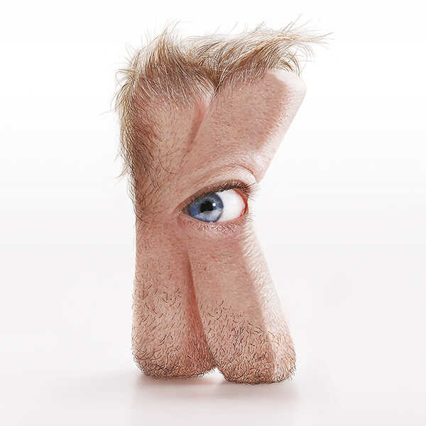
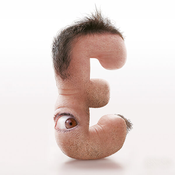
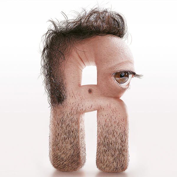
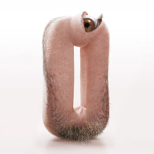
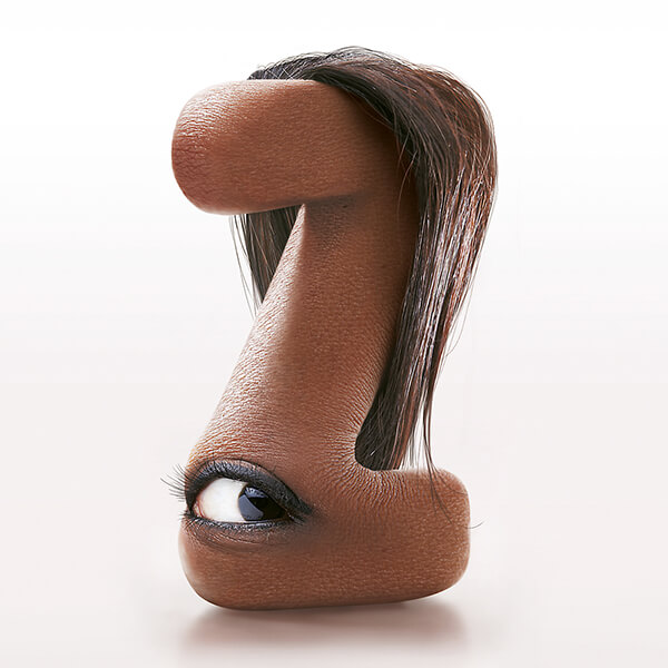
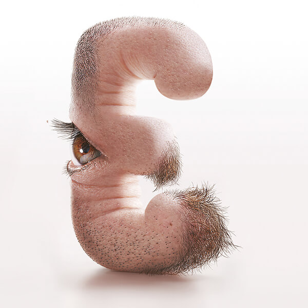
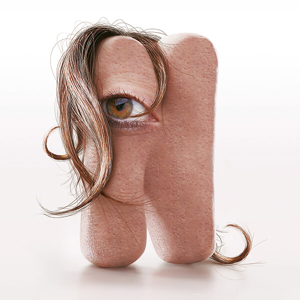
As a big fan of Typography design, we have been featured many creative typography. However, we have to admit the one featured in today’s post probably is the most stocking / disturbing typography we’ve ever seen. Created by creative director JC Debroize, each letter of alphabet is designed with human characteristics including skin, oddly placed hair, and peering out eyeballs. I know, it sounds creepy right? However, once you get past the initial surprise / discomfortability, you might be able to appreciate the fine details, the extraordinary textures, and the originality of the series.
To design letters like this, Debroize first created the shapes with modeling clay and then developed the incredibly detailed, flesh-based letters in Photoshop. Debroize designed 7 letters with 2 versions of E to spell out the company name “Kerozen”. Would you want your company name shown in those types of human typography? Although it is quite unique, still a big ‘no no’ for me….
