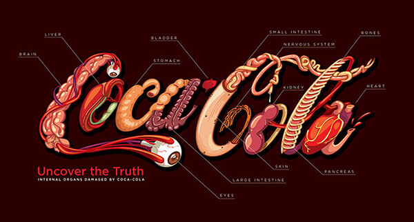
As a person who gets used to drink at least a can or two Coca-Cola each week, I have been told so many times it is not good. And today, I came cross to this illustration named “Uncover the Truth – internal organs damaged by Coca-Cola.” and find myself a bit offended at the beginning. Why Coca-Cola? There are so many coke products, if they are harmful then all of them should be. If the illustration is drawn for the purpose of public awareness, should the artist use more generics Coke instead of Coca-Cola?
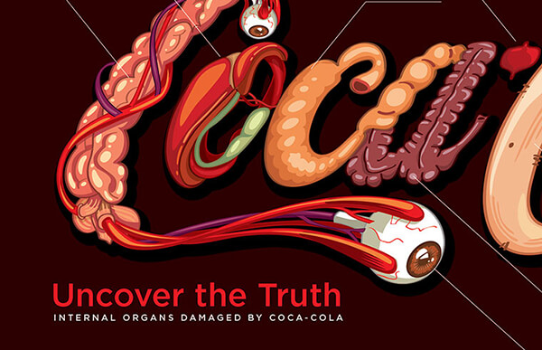
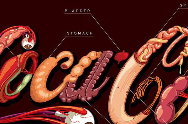
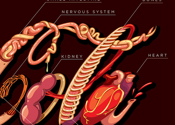
By looking at the illustration closely, I am quite surprised to find coke can actually cause that much harm – brain, liver, eyes, stomach, bladder, large intestine, small intestine, nervous system, kidney, pancreas, bones and heart! According to the artist, Nicaragua-based designer Fabio Pantoja, all those organ can be harmed by drinking the classic soda. Hence, Pantoja re-design of Coca Cola’s logo with a dark twist: the letters depict the different organs and parts of your body that suffer damage after having too much soda.

Artistically, it is a visually attractive project. However, as a public awareness raising project, I think it is a failure. I did some research and I can’t find how the artist get the list of organs shown in the drawing. Simply rearranging the organs in the shape of a famous logo just make me think the organs are there not because they got harmed when drink coke but artist needs their shape there. I couldn’t feel the harm by looking those names, honestly. Moreover, as a web project, if the artist does want people know more about the harm caused by coke, please at least provide the reference underneath the picture so people can go over and get more information. Right now, it is a just grandstand and meaningless project for me. What do you think about it?


