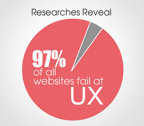
At the end of the day, ecommerce websites exist to drive conversions. True, websites also play an important role in establishing brand voice and design. But these factors only add value if customers are able to smoothly journey through your sales funnel. Why? Because hurdles can easily turn into dead-ends during the online shopping process. Understandably, shoppers want to avoid frustration, confusion and delays—and won’t hesitate to leave a website that complicates the process of online shopping in even a “minor” way.

It’s always the right time if your ecommerce user experience is costing you conversions.
How easy is your online store to understand and navigate? Are there any particular problem areas slowing down visitors, or even causing them to exit your site? Does your website help the shopping process or hinder it? These are all valid questions to consider as you turn a critical eye to your UX with the intent of making it as high-quality as possible.
Here are a number of common ways in which eCommerce websites fail to optimize their UX— mistakes that can ultimately cost important conversions, decreasing revenue and customer satisfaction in one fell swoop.
Site Ignores Design Prototypes
Customers have certain expectations when they visit websites. If your online store disregards these prototypes, your UX will likely be confusing to visitors. For example, ecommerce websites typically feature a shopping cart icon in the top right corner. Thus, shoppers have been conditioned to look and scroll to this area for access to their shopping cart. A quick way to alienate site visitors is by failing to meet this expectation because shoppers will then have to spend more time and brain power looking for the “missing” shopping cart. Any time you ask shoppers to perform extra legwork to make a purchase, you’re taking a serious gamble.

So, although your website should have a unique look and feel, avoid prioritizing creativity or uniqueness over certain tried-and-true prototypes. Step back and take a good hard look at your website through customers’ eyes. Are you meeting expectations where it counts?
Poor Image Quality and Optimization
Aesthetics are a big piece of UX and shouldn’t be looked over if you’re hoping to increase conversions on your ecommerce site. Utilizing high quality images and background removal services can help you portray your products in the same way as you would show them off in a store. Providing high quality images and optimizing them properly also ensure that they don’t affect your site speed.
Landing Pages Take Too Long to Load
Just a few seconds can make or break the possibility of earning a sale. Almost half of web users now expect a website to load in two seconds or less. Many will abandon a site that takes three or more seconds to load. It’s imperative your website is optimized for speedy load times on both mobile and desktop devices. One way to prioritize quick loading is to compare enterprise eCommerce platforms; this step will help you make sure your software and infrastructure has the bandwidth to support visits and transactions at the volume your store requires. After all, the best online shopping experience is so responsive and seamless that customers barely notice the website because they are free to go about their business. Only if your website lags, glitches or freezes will their attention focus on its shortcomings, which will not reflect positively on your brand as a whole, even if your product lineup is stellar.
Site Offers Clunky Mobile Experience
As Crazy Egg points out, “Even though responsiveness has received a lot of attention over the past few years, there are still too many stores who are clearly designed desktop-first.” An ongoing shift in mobile usage means people are using smartphones and tablets more in general and using them to complete transactions rather than just to conduct research on the go.
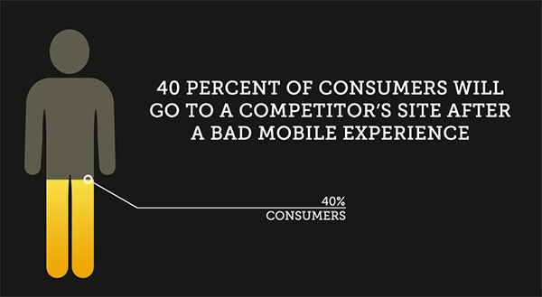
Any modern eCommerce store looking to remain competitive must offer a responsive, secure mobile UX in addition to its desktop version. This goes far beyond just shrinking down your interface to a smaller screen. Rather, it requires an intuitive understanding of how consumers browse on mobile devices. Excessive scrolling, tiny fonts and confusing navigation are all deterrents in this arena. Capturing mobile sales is a matter of rethinking mobile browser UX and, increasingly, offering a designated mobile app as well. With m-commerce rates continually on the rise, these conversions are simply too important to ignore.

Website Lacks Navigation Features
Have you ever visited a website with all the bells and whistles, but none of the core functionalities you need to find your way? You have to walk before you can run. It helps to turn your focus to the basics from time to time: navigation and site search. Ask yourself these questions as you’re evaluating your website:
- Can customers find the navigation bar easily from any position on the website?
- Are the link and dropdown options on the main navigation bar helpful?
- Is the site search tool easy to find and use?
- Can shoppers filter search results for a more granular view of products?
- Can site visitors easily navigate backward and forward as needed?
Navigation makes up the backbone of your online store. Customers need a way to get from point A to points B, C, D and beyond. Make sure the paths are clear so shoppers can proceed through your sales funnel unimpeded. If people have questions or are in a hurry, they will turn to site search. Make sure your site search tool is obvious and highly usable. Remember: “No Search Results Found” is a dead-end. It’s always worthwhile to recommend similar products or make suggestions to guide shoppers along their way. Configure this tool to account for spelling mistakes, as consumers may make typos in their haste.
UX: The Bottom Line
Is your eCommerce user experience costing you conversions? The functionality and design of your website directly correlates to your bottom line. In today’s busy world, it’s safe to assume online shoppers have very little extra time. Every improvement you can make to your site’s loading, navigational and mobile experiences will help people find what they need faster. Furthermore, it will encourage them to buy it from you rather than a competitor. It pays to audit your site and make continuous UX improvements as your ecommerce enterprise grows.