

Despite living in an era where digital interactions are more the rule than the exception, tangible items like printed materials remain valuable tools for networking and brand visibility. Business cards, in particular, continue to serve as a powerful first impression, conveying professionalism, creativity, and attention to detail. Choosing the right style of card—horizontal or vertical—can subtly influence how your brand is perceived.
When considering design aspects such as vertical vs horizontal business cards, businesses have the opportunity to tailor this small but significant detail precisely to their audience and brand ethos. However, layout choice is just one part of the overall design strategy. Understanding how different elements of your printed materials interact can ensure they complement your wider branding goals.
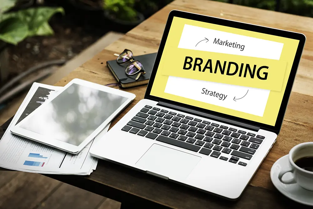
Aligning Design with Brand Personality
Your printed materials, particularly business cards, should clearly align with your brand identity. A cohesive visual language across all touchpoints creates recognition and fosters trust. Every aspect, from colour schemes and design trends to layout orientation, conveys messages about your company’s character and values.
Traditional brands typically prefer horizontal layouts due to familiarity and practicality. The landscape orientation fits standard business card holders easily, aligns with natural reading patterns, and offers generous space for essential information. It is generally perceived as conventional, dependable, and professional – perfect for sectors like finance, consulting, or legal services.
On the other hand, vertical business cards convey a modern, innovative image, making them ideal for businesses looking to present themselves as creative, forward-thinking, or distinctively different. Portrait orientation is popular among design studios, technology start-ups, freelancers, and creative entrepreneurs seeking to distinguish their personal brands.
Practicality and Everyday Use
When choosing a business card layout, it’s wise to consider the practical everyday interactions of your target audience. Cards should easily fit into wallets, cardholders, or desk organisers to maintain usability. Horizontal cards naturally integrate with traditional storage solutions and are therefore less likely to be misplaced or overlooked.
Vertical designs, while eye-catching and contemporary, might present slight storage challenges. Nevertheless, their unique format often compensates by standing out more prominently among standard-sized cards. For businesses prioritising brand recognition and differentiation, the small inconvenience of unconventional storage may be worth the added impact.
Communicating Clearly and Effectively
Effective design must prioritise clarity. No matter the layout you choose, essential information, such as your name, contact details, and company name, must remain immediately accessible. Avoid overcrowding your card; simplicity usually enhances readability and professional appearance.
Horizontal cards allow ample space for clearly presented, comprehensive details. They lend themselves naturally to balanced design, often dividing the card neatly into segments for logo, text, and whitespace. Meanwhile, vertical cards typically require more minimalistic approaches, encouraging concise information and intentional design decisions to maximise the narrower space effectively.
The Importance of Visual Balance
Achieving visual balance means your design feels comfortable and professional. Balanced cards have a structured layout that guides the viewer’s eye effortlessly through the provided information. This can involve careful placement of logos, selection of complementary fonts, and strategic use of whitespace.
Vertical cards require a carefully considered approach to balance due to their limited width. Designers often employ bold typography, strategic whitespace, or vertical alignments of text and logos to achieve harmony. Horizontal designs tend to achieve visual balance more naturally, given their inherent space and alignment with conventional reading patterns. Nevertheless, each layout demands thoughtful consideration of typography, colour, and spacing to ensure a polished and professional finish.
Enhancing the Design with Material Choices
Beyond layout, the choice of materials greatly influences perception. Selecting high-quality paper stock or special finishes such as embossing, foil stamping, or matte lamination can elevate even a simple design, conveying care and sophistication. Quality materials suggest reliability and attention to detail – qualities most brands wish to project.
Even small variations, like rounded corners or subtle textures, can differentiate your business cards from competitors. These choices should reflect the character of your brand while enhancing usability and durability. A memorable business card combines thoughtful layout, clear communication, and quality material to deliver maximum impact.
Incorporating Sustainability in Print Choices
Increasingly, brands consider sustainability as part of their broader image. Eco-friendly paper stocks, recycled materials, or sustainable inks resonate positively with environmentally-conscious customers. Choosing sustainable print options doesn’t require compromising quality. In fact, it often enhances brand reputation and appeals to ethically minded audiences.
Brands that clearly communicate their commitment to sustainability through their printed materials can strengthen their connection with customers who value environmental responsibility. Sustainable printing choices subtly reinforce company values and contribute to a positive brand image.
Leveraging Design Trends Effectively
Design trends evolve continually, and businesses that stay informed can leverage popular aesthetics effectively. Minimalism, bold typography, clean lines, and vibrant colours are currently popular trends in print design. Incorporating these elements thoughtfully can update your brand image without losing alignment with your core identity.
However, chasing trends for their own sake risks diluting brand authenticity. Effective design blends contemporary aesthetics with long-term brand consistency, ensuring printed materials remain relevant and appealing beyond temporary fads.
Final Thoughts
Choosing between horizontal and vertical business card layouts involves balancing visual appeal, practical usability, and alignment with your brand’s personality. While traditional horizontal layouts offer familiarity, ample design space, and practical storage, vertical cards can strongly differentiate brands seeking innovation and modernity. Ultimately, your decision should consider how your target audience interacts with printed materials, your branding objectives, and practical usability.
By thoughtfully considering each aspect, from orientation and visual balance to material quality and sustainability, you can create a lasting, professional impression that strengthens brand recognition and supports meaningful business relationships.