Google Fonts is one of the largest – if not the largest – font directories on the web. It currently contains well over 600 font families, all of which can be downloaded and used in a variety of projects at the touch of a button.

Unlike other popular font directories such as Adobe’s Typekit – which requires a yearly subscription starting at $49.99/year – all of the typefaces hosted by Google Fonts are 100% open-source and therefore, completely free of charge to use.
However, despite the abundance of typefaces available from Google Fonts, the art of actually pairing these typefaces is still an extremely difficult and time-intensive process. Many designers spend countless hours – if not days – comparing and mixing typefaces in the hope of creating the perfect pairing for a project.
If this sounds like a common problem you personally face, we’ve found a cool infographic that has the potential to really help you out.
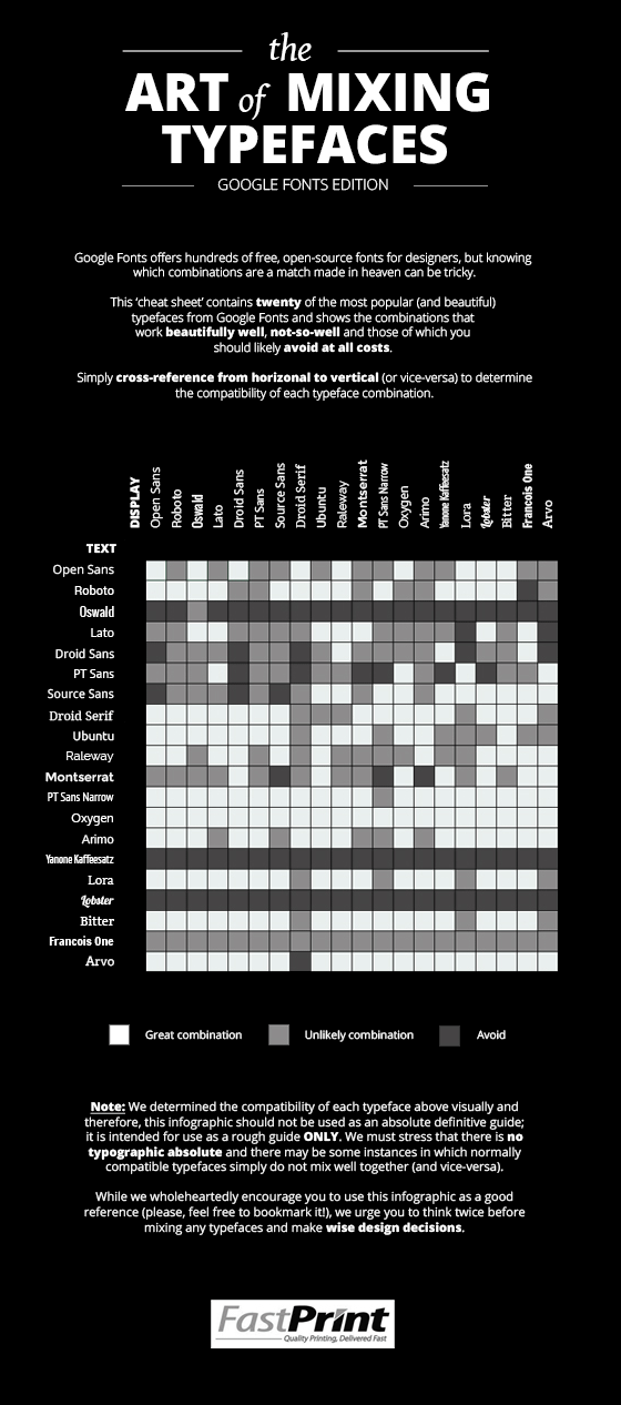
Created by the guys over at FastPrint.co.uk, this infographic – named “The Art of Mixing Typefaces: Google Fonts Edition” – shows the compatibility of 400 fonts, which are arranged neatly in a color-coded grid.

How do you use the graphic? It’s easy; simply choose a font and cross-reference it on the chart.
If the colour of the square at the reference point is white, congratulations, you’ve found a top combination. If it’s grey, it might be worth a rethink. If it’s black, well, it’s probably wise to go back to the drawing board and opt for a different combination altogether.
It’s important to note that the y-axis shows body fonts while the x-axis shows display fonts; this is why you’ll see the same twenty fonts repeated on both axes.
Display fonts are generally best for large type such as headings, subheadings, etc., while body fonts are better for paragraph text.
So, whether you’re looking for the perfect font pairing for a print or web project, you can be sure to save time and money by letting this infographic do the hard work for you.