Who doesn’t want a great internet visibility and credibility in the online world? Of course, everyone loves that, and there are different ways to turn them into a reality.
Aside from social media platforms, creating a website has been a common practice by businesses of any niche and size. When established according to the industry’s standards, a website is a quick and convenient way of communicating information between potential visitors and prospective clients.
A professional website can also expand your market. But developing your services and products should not be ignored. Make sure it can address the pain points of your target market.
A responsive website can level up your customer service. As days pass by, you can fix delays in your response time. Whenever a potential client raises questions or other concerns, your representatives can handle them with quality and convenience.

Due to the generation of leads, web traffic, and constant sales, tons of people began creating websites for their business. This means the competition will be intense and complicated. If you are a web designer, be sure to include a detailed web design contract for your projects.
If you are a business owner, you want to stand out from the rest. Don’t worry! Some web design trends are discussed below:
Oversized Elements
Before, small elements worked but not anymore. Today, oversized type and elements are a trend among those who establish websites to communicate the message clearly.
Big, bold typography, oversized website menu icons, and fullscreen images are good practices to consider.
However, limit the number of design elements on your page. Many grand features might be overwhelming and tiring at the end of the day. So, make your website balanced with accuracy, too.

Split Screen Content
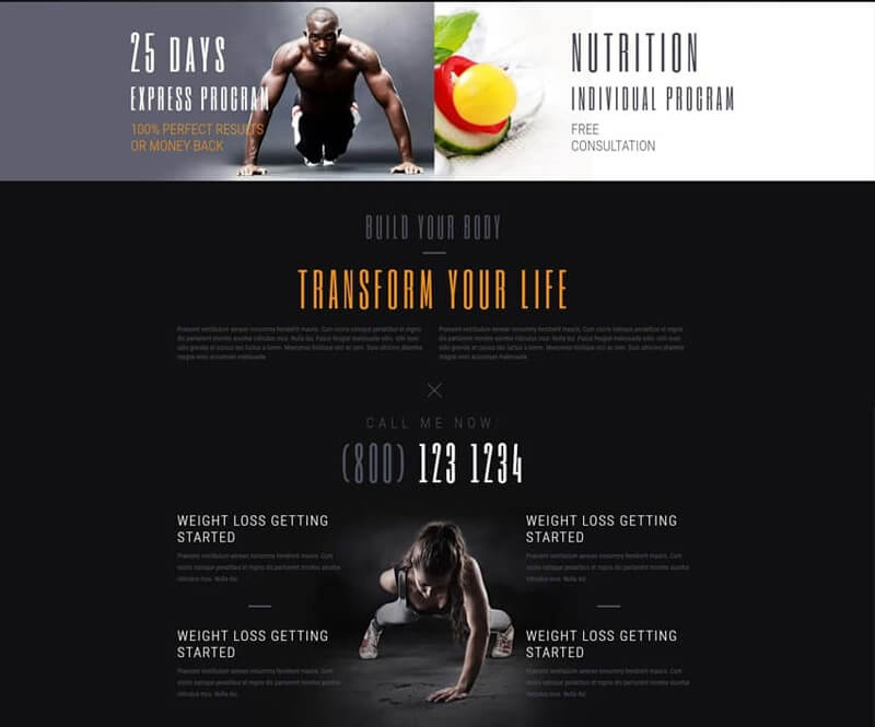
Aside from oversized elements, split-screen content is another popular web design technique your competitors might be using already.
How to get started? Simply divide your page into two. Then, make both sides different from each other. Doing some research online and using your creativity can help you throughout the process.
More particularly, you can add a logo, menu header, and a Call-to-action button. There are many things to understand. If you have a hectic schedule, it’s a bright idea to rely on a certified and experienced professional.

Solid Color Blocks
Over the years, the split-screen trend has continually increased popularity from different corners of the world. It’s no surprise as businesses, non-profit organizations, and bloggers can express several messages effectively.
If you’re planning to adapt this web design strategy but don’t know how to make it happen, simply break up your content into more parts. This can lead to a variety of rectangles and squares.
After that, place a photo and some short lines in every section of your page. As a result, your visitors could follow every information on your website with a smile and joy.
Even if this trend allows you to display different items in a striking web layout, make sure the final result is free from haphazard collage work.
Be sure all the color blocks match each other. Plus, they must be aligned to one another.

Whitespace is Key
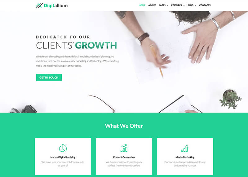
Known as negative space, whitespace refers to the blank areas in between your design elements.
Designed to give your page a spacious and well-balanced feel, whitespace is a great way to make your website user-friendly, catchy, and easy to navigate.
Commonly available in white, negative space can be made with other background colors depending on your preferences and interests.
Sometimes, it includes enough space in lines/columns of text or margins around a page.
Although some people consider it a waste of space, its main purpose is to provide your audience with a breath of fresh air. Also, it can boost legibility, create an overall pleasing appearance, and highlight CTAs.
Exposed Windows or Grid
Exposed grid or window is another trend you shouldn’t miss today. How does it work? What makes it different from other web design trends? Well, the grid, including its guidelines, are now exposed because website designers want to highlight the screen segmentation with its building blocks.
3D Digital Artwork
A unique interpretation of familiar material, 3D digital network decorates websites in neon-colored shades. Started years ago, 3D digital artwork is no longer new. But 2020 is the year where it makes noise over the internet. When combined with some fluorescent colors, the final result is energetic and futuristic with a touch of your personality.
But never overdo this web design trend. Always consider neutral shades as the primary colors such as gray, white, and black.
Overlapping Layers
Probably, you have exerted great effort to add depth to your 2D screens. How’s your experience? Is it successful? No? Then, your long wait is finally over. Layering up all the elements on your webpage will be your best bet.
To achieve the layered effect, all you have to do is to place some elements on top of one another. It’s hard, isn’t it? Let a certified and licensed specialist handle the job for you.
Yes, the look will be rich with visuals? Now, does it affect the organization and aesthetic value of your page? Definitely, not! When handled with attention and care, your website will remain legible and orderly.

Motion
Another web design trend is video or animation. Similar to other practices in this list, motion is a surefire way to catch or incite visitor’s interest and attention.
While there are various forms of motion, micro-animations, typography, fullscreen video headers, and animations are a worth-it and meaningful investment.
To maximize the benefits of motion and animation, think of specific areas you want to draw attention from your target market. Then, never overdo this trick as it can be distracting.
Bottom Line
Is your existing website unable to open more successful business opportunities? Are you planning to construct and develop a site this 2020? Whatever your reasons may be, these web design trends can guide you throughout the process.
Of course, some might have a prior experience. But nothing can beat the services of a licensed and sought-after professional. While they design your website, you can have enough time to focus on other important business aspects.