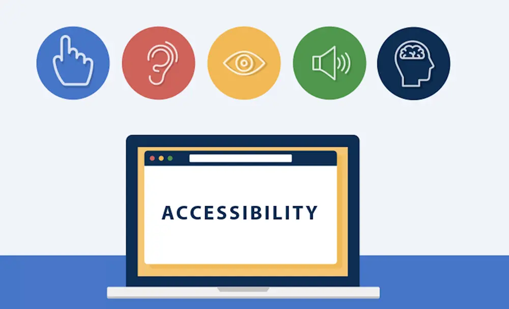
When was the last time you thought about website accessibility? If you are anything like the majority, it is probably not top of mind until a problem arises. Perhaps a site that you go on is hard to navigate or the text is simply too small to read. And this is where accessibility comes in-it’s about making sure everyone can use your website, regardless of their abilities. But here’s the thing: it’s not a one-and-done kind of job. It is something that needs constant attention and improvement. And that’s where feedback loops come in. Let’s break it down.
What’s a Feedback Loop, Anyway?
Put simply, a feedback loop is only a system to continually get feedback, make improvements based on that input, and then repeat the process. Think of it like a cycle: gather feedback, adjust, test again, and keep going. With websites, this means listening to users with different abilities, understanding their challenges, and tweaking your site to make it better. These small improvements, over time, add up to make the site truly accessible for anyone.

Why Does Accessibility Matter?
Let’s get real for a second. You wouldn’t want to turn away one potential user, would you? In all seriousness, accessibility isn’t being “nice” or “socially responsible”; it affects how effective a website can be. Think about this: recent statistics show that over a billion people worldwide live with some form of disability. That is huge, related to the number of your possible audience! If your site isn’t accessible, you’re missing out on connecting with people who need it most. Plus, accessible websites tend to have better overall user experiences, which leads to higher satisfaction and more engagement.
How Do Feedback Loops Help?
So, how do these feedback loops fit into the picture? Let’s walk through it.
Step 1: Listen to Your Users
The first step in improving accessibility is to listen to your users. And who better to tell you what’s working and what’s not than the people actually using your site? This can come from a variety of sources, user testing, surveys, or even just direct feedback through support channels. Perhaps somebody’s having trouble navigating with a screen reader, or there’s some color contrast issue that’s making it hard for them to read your content. By directly gathering feedback from persons with disabilities, specific barriers can be identified and efforts can be made to address them.
Step 2: Make Adjustments
Once you’ve gathered feedback, it’s time to make some adjustments. This could mean tweaking things like font sizes, adding alt text to images, or improving your navigation for screen readers. These changes don’t have to be huge at first; even small improvements can have a significant impact. The goal is to create an experience that’s smoother, clearer, and more intuitive for everyone.
Step 3: Test Again
That’s where the feedback loop really comes in. Once changes have been made, it’s time for more testing. Bring in users again or utilize accessibility tools to see how well the updates are working. Did the fixes address the issues you were hearing? Are there still missteps for some users? Remember, accessibility isn’t a “set it and forget it” kind of thing-it’s a continuous process of betterment.
Step 4: Repeat the Process
Here’s the key takeaway: accessibility isn’t a final destination. It’s a journey. And feedback loops ensure you’re always moving forward. With each round of testing and adjusting, your website becomes more accessible and more user-friendly. The best part? The process doesn’t end. As technology advances, user needs evolve, and new accessibility challenges emerge. That means there’s always room for improvement.

What Kind of Feedback Are You Looking For?
Not every type of feedback is equal, and some will be simply content to tell you that your site is “okay.” Others will take the time to let you know exactly what’s not working for them. The more detailed and actionable feedback, the better. There are a few areas on which you’ll want to focus:
- Navigation issues: Can users navigate the site by using a keyboard or by using a screen reader? Are all links and buttons well labeled?
- Color and contrast: People with low vision or color blindness can read your text and understand your content?
- Content clarity: Your content should be easy to read and understand by people with cognitive disabilities. Use clear language, breaking information down when possible.
- Error messages and forms: Is your form with assistive technology? Do error messages give useful instructions?
How Can You Collect Feedback?
Now that you know why feedback is important, how do you actually get it? There are plenty of ways to do this:
- User testing: Invite a variety of people with different disabilities to use your site. Observe any struggles they might have and ask them to suggest any ways you might improve.
Surveys and forms: Add accessibility questions to surveys or support forms. You can ask visitors about their experience using your site and if they encountered any issues. - Analytics tools: Website accessibility checkers will automatically flag common barriers to access, such as missing alt text or poor color contrast. If you’re not sure where to start, employing the best website accessibility checker will get you a good foundation for improvements of common issues.
- Social media and customer support: Keep an eye on social media and any feedback coming through your customer support channels. If users are reaching out with accessibility concerns, take it seriously!
Final Thoughts: It’s All About the Users
Website accessibility isn’t a one-time checklist. It’s an ongoing process, and feedback loops are the key to making sure you’re always improving. In doing so, you proactively request users for input and continuously test and refine to ensure your site remains accessible to as large an audience as possible. And isn’t that the bottom line? Ensuring that everyone, regardless of their abilities, has a seamless and enjoyable experience on your site? What are you waiting for? Join the feedback loop today to make your website great for all users!