The 90’s was a time of digital innocence. The internet was just making its first strides into households and the creation of HTML made web graphics accessible. The door was finally open for common people to surf. And creative website design was born.
The early graphic web we remember is very much associated with sites like GeoCities, which allowed anyone to operate their own little slice of internet. People’s sites were characterized by dancing GIFs and HTML frames, by basic colorful text and guestbooks to cherish the memories of past visitors.
Design is cyclical and it’s extremely common to revisit visual trends twenty or thirty years later. But the 90’s web was much more than an aesthetic, it was a showcase of individualism, one in which people owned a small piece of digital real-estate and made it their home.
Most people no longer maintain their own sites, rather a profile on a large platform like Facebook or Twitter. But with people transitioning away from traditional jobs and leaning more into the digital nomad career path, having your own digital home is coming back.
Revisiting the 90’s internet is more than a retro design trend. It is, in many regards, an attempt to return to a former model, one which is regaining its importance in recent years.
These are six modern websites, throwing back to arguably the greatest era in online history, to get you inspired to design your own.
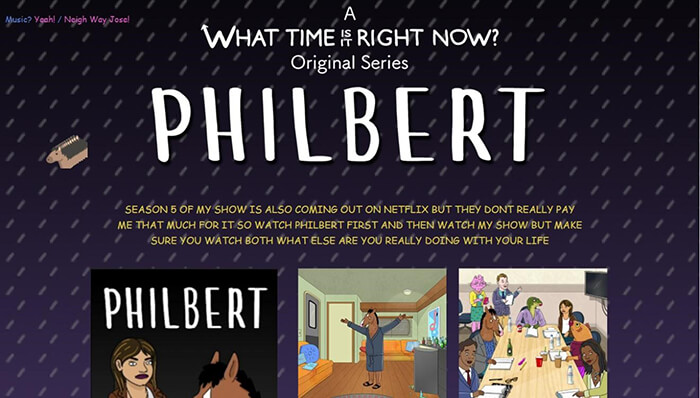
Netflix’s beloved fake 90’s sitcom star, Bojack Horseman, has his own portfolio, as any actor should. But as you may know, Bojack never really recovered from his greatest decade, as is evident in his GeoCities inspired website.
The plain text and customized mouse, or in this case horse, make it immediately clear, we’re in the 90’s now. A time when your web page was a shrine to your favorite things, providing you with an all-consuming environment, favorite song included. Just hit “Yeah!” in the top left corner to listen to Bojack’s. Spoiler alert: it’s the theme song to his hit show “Horsin’ Around”, of course.
Keep on scrolling for every 90’s web design cliché. From the visitor meter, through the flame GIF, to images that failed to load, leaving you with just the alt text to give you a clue into the “tasteful” pictures he meant to have on display.
Poolside FM
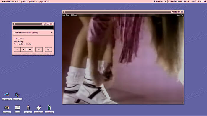
Poolside FM delivers a different take on our favorite decade. Instead of going for the particular web design aesthetic, they provide the entire “first PC your parents bought in 1994” experience.
Upon arrival you’re greeted with a DOS system boot up, which we all know is just standard computer stuff, like “Verifying Mojito.DLL” and “Applying Hawaiian-Tropic SPF-500”. Once it’s loaded, you’ll find a rad 90’s desktop replica, where the clock is always set to 1997. It may look like Windows 95, but you’re actually running on their very own “Pool OS”.
Poolside.FM, as the name suggests, has a built-in music player, playing four radio stations full of uplifting electronic beats and summery vibes. But the experience really isn’t complete without Poolside TV, playing a seemingly endless array of homemade video clips from the 80’s.
Poolside is an ode to 90’s summers, to MTV pool parties, to family trips to the nearest theme park. It fully understands what the 90’s were all about – changing desktop themes and watching 80’s reruns.
It’s Britney Bot
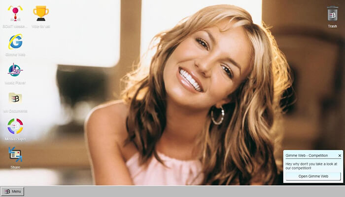
Digitally, the 90’s were much simpler times. Which is probably why just looking at an old desktop screen brings back memories. A fact put to great use with Britney OS ‘99. Yes, this is yet another Windows knock-off. But that’s not the main attraction.
It doesn’t get much more 90’s than popstar celebrities, none of which reached the heights of America’s sweetheart – Britney Spears. It’s Britney Bot is here to make your teenage dreams come true. Just open the BOMT messenger to chat to the superstar that graced your childhood bedroom’s posters. Well, chat with a generic bot that feels like it was coded in the 90’s, good enough.
Browse around the desktop to find a whole bunch of era-fitting media, such as photos, songs and of course, the “Gimme Web” browser, with the homepage appropriately set at www.britney.90s.com. It’s a Britney fan site inside a Britney fan site, it’s Britception.
It’s Britney Bot taps into a primal feeling of nostalgia. One which could only be achieved through the likes of pre-Toxic Britney.
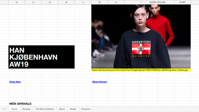
Han Kjøbenhavn’s website takes yet another approach. The menswear brand’s site is designed as a spreadsheet. Though not often thought of as a 90’s web staple, the basic core of spreadsheets hasn’t really changed since Microsoft came out with Excel in the late 80’s. Making the design options pretty much on par with early 90’s HTML.
Though the site’s concept would probably seem odd and uninventive 25 years ago, in modern times, it actually fits in perfectly with the throwback design trend. The plain text jumping out of the white background, along with the seemingly random placement of images in the space gives off the feeling of the early graphic web.
The menu, designed as spreadsheet tabs, lets you browse the online shop as if it were last month’s invoices. Which is perfect if you enjoy shopping for sunglasses during office hours.
The design’s simplicity, along with the blue, underlined hyperlinks, are really all you need to feel young again, proving that a retro design doesn’t necessarily have to be an accurate replica of the times.
Andrew Onorato
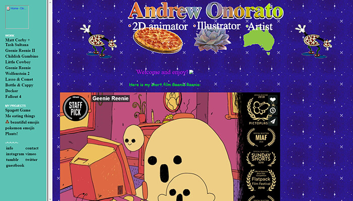
Melbourne based illustrator and animator, Andrew Onorato, must have grown up in the 90’s. This artist’s portfolio would definitely not seem out of place in the actual 90’s. Well, if you disregard the Twitter and Instagram links.
Onorato hits all the right bases for the perfect throwback. The dancing pizza gifs, the twinkling star background and the HTML frame are straight out of your favorite GeoCities sites of the time. The site even boasts a Flash game to play in your browser, it doesn’t get much more junior high school than that.
The site really pulls out all the 90’s stops. The guestbook, the personal bio showing off Onorato’s plants and the link to his lizards’ blog really drive the point home. It’s a perfect replica of 90’s individualistic web culture.
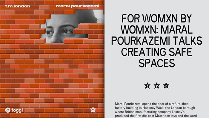
Timesheets Magazine borrows heavily from 90’s design aesthetics, while upping the ante and creating something that probably would not be able to exist at the time.
The London art magazine starts you off with a split page. On the right, you’ll find the names of the featured artists, in clunky 90’s appropriate text. To the left, a very retro animated brick wall. Move your mouse around to knock the bricks over and reveal the video hidden behind. A concept reminiscent of early graphic PC videogames, back when one CD contained 100 games.
Choose an artist to get an article on the right, with a picture to left, if you’ve broken down enough of the wall… When scrolling through, relevant images pop up on the left. The random feel of the design is fully 90’s, while the engaging magazine layout is modern and intuitive. Timesheets Magazine plays into the retro trend just enough, without taking away from the modern web experience.
