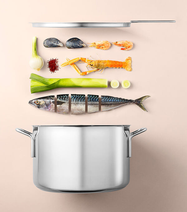
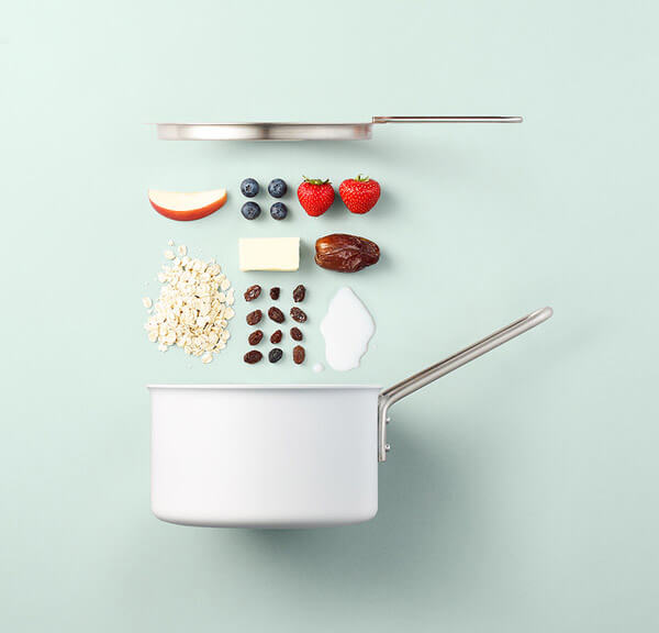
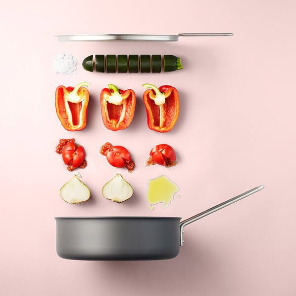
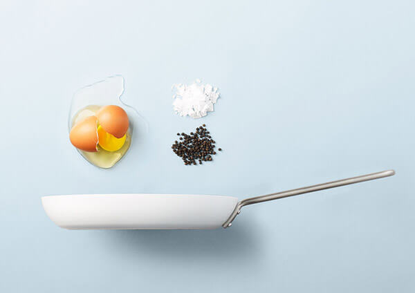
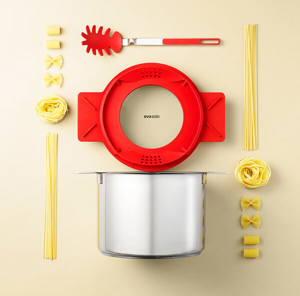
Unless I read the description, I wasn’t aware this is a series ads for the cookware company Eva Solo and just thought they are some interesting photography project about the food and recipe. Not sure is that a successful design or not. However, its minimalist appearance and neat arrangement of food is quite appealing as a visual recipe. But anyway, here is the words from the artist about the idea behind this project: We tried to show a product and ingredients together, illustrating a certain dish ideally made in that specific product. The images both function as a presentation of a product and as inspiration to various recipes.
