Are you planning to design a new digital product based on customer experience?
Here’s a design principle no one probably ever told you – never design your products solely based on what customers say they want.
Confused, right?
Companies with excellent and innovative products based their design on customer action. Why do you think companies like Amazon and Facebook are the market leaders? It’s not luck. Their success is attributed to careful planning, development, and creating a positive user experience.
A user experience focuses on how the design works and not how it feels.
4 Design Strategies that Sets a Successful UX Apart
There is a thin line of difference between a successful and unsuccessful UX. Incorporate these four UX design strategies to design a successful UX.
1. Comprehensive UX research
User experience is the ABC of building products that resonate with the target audience. Why?
According to Forbes, every dollar invested in UX brings back a whopping $100 with an ROI of 9,900%.
That’s why UX research is essential and could be the answer to all your design-related miseries.
UX research is the backbone of your design strategy and helps create optimal products that resonate with your users. The ultimate goal of this research is interaction with end-users to understand the impact of design. It helps in removing guesswork and leaves no room for assumptions and intuitions. This phase is critical in understanding user behavior and helps designers know the potential points of design frustration.
Use Maze’s UX research guide to create a research plan and use different research methods to create a product that the user values.

Always remember a UX design starts with users and ends with them.
2. An organized information architecture (IA)
Information architecture is all about labeling and organizing your design product, whether it’s a website or software. It’s a blueprint and a visual representation of your product’s features and hierarchy. An IA helps connect your content with the functionality and provides the designer with a bird-eye view of the product.
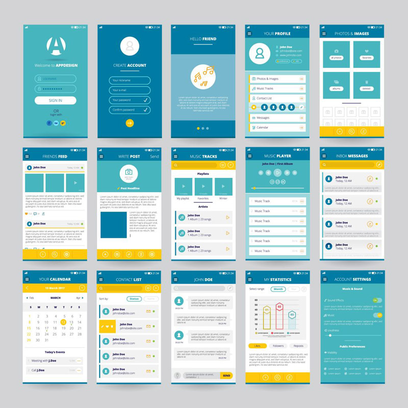
For example, when designers build apps, they create a layout of individuals’ screens to find information quickly. They also ensure proper flow, which helps a user navigate between different screens. It’s the IA that determines this flow and organization of information.
The IA document becomes the Bible when designers update the existing features or develop new ones. As it’s critical software and could be the reason for your design success, create an information architecture using documenting software.
From organization and labeling to an easy-to-go-navigation and improved search system – your IA covers every aspect to make your design stand out.
3. Visually attractive design
You have a tenth of a second to make a positive first impression. That’s the window a user gives brands to showcase their products. That’s why visual designs govern user experience and ensure you make the maximum out a tenth of a second.
From layout, color to pictures, graphics, and videos, these UX design elements are essential for creating visually attractive designs. Not only do these elements add an aesthetic appeal, but they also make the design more interactive.
The rule here is simple:
A product or website that lacks visual elements leaves a dent in the value of your product.
Furthermore, according to the aesthetic-usability effect, users ignore design flaws with eye-pleasing and aesthetically attractive products. When creating your design, focus on the five visual design principles: Gestalt, Contrast, Hierarchy, Scale, and Balance.
4. Excellent interfaces and interactions
How a user interacts with your website page determines the success and failure of your design.
The navigation element you incorporate becomes an interface between your site and the user.
In design language, everywhere a user clicks, types, or hovers, the cursor is known as an interaction interface. The interaction interface could be forms, call-to-action, links, or even simple scrolling or searching through the content for a website.
According to Human-Computer Interaction, some methods of interaction interface are better than others. It helps decode specific areas where a user is most likely to click. Though you don’t require in-depth knowledge on HCI, put yourself in the users’ shoes and think about how a user interacts with your webpages or products.
Follow these five principles of interface and interactions to set your UX apart from others:
- Follow the principle of least surprise
- Draw the attention of the user’s eye
- Provide an option of ‘undo’ for all user actions
- Speak the user’s language
- Be consistent in your interactions
Conclusion
Success mantra for 2021: UX is about flows and organization. Friction confuses users and deteriorates your product’s perception. The four UX design elements mentioned above sets your product and UX apart from others.
It ensures your design is not confusing and works towards making every moment of the user interaction count. When you improve your UX, you will automatically see a rise in website traffic, revenue, and brand perception.
Design is a silent yet most effective brand ambassador. Make the best use of it!

